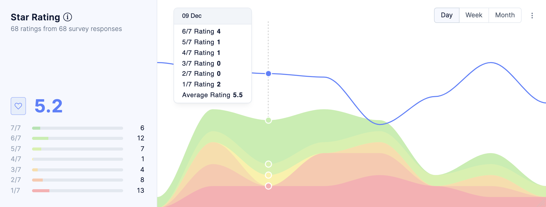
Our new dashboard just got another upgrade before the official launch. You can now visualize the average number of “Star Ratings” (also Heart, Thumbs-up, Numeric ratings) you’ve received.
Similar to our NPS and CSAT charts, the Ratings chart displays overall totals on the left and a timeline on the right.
Like all other charts, you can choose which data gets included in the visualization. You can choose specific survey questions, and filter responses by segments, surveys and tags.