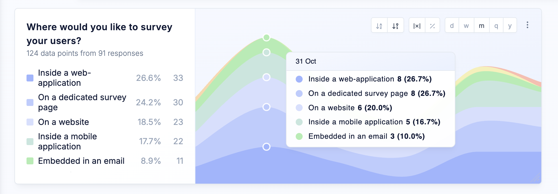
We’ve introduced the new Distribution Trend Chart to help you better understand how survey responses evolve over time. Instead of focusing on a single metric, the chart visualizes the full distribution of responses as colored areas across a timeline, making shifts in user sentiment immediately visible.