8 In-app Messaging Best Practices for SaaS
TL;DR
- Effective in‑app messaging depends on clear goals, audience targeting, relevant triggers, UX consistency, limited frequency, design consistency and performance tracking
- Messages should be brief, contextual and aligned with user behavior
- Segment messages based on user activity, role or lifecycle stage
- Monitor views, clicks, dismissals and follow‑through actions to optimise success
Looking for in-app messaging best practices? Want to find out how to run successful in-app messaging campaigns?
I won’t deny it; being able to connect with and communicate with users as they interact with your product truly feels heaven-sent…
…until you get it wrong, that is.
And it’s so easy for that to happen, I’m afraid.
I’m sure you’ve experienced it first-hand, too, as a user. You’ve been subjected to some pointless messages jumping at you within the apps you use. Messages that, instead of enriching your user experience, disrupted your flow, and made you curse under your breath.
So, in this guide, I decided to help you never do the same to your users.
Below, you’ll find eight best practices for sending in-app messages.
But first, a super quick recap to ensure that we’re on the same page…
So, first things first…
What are in-app messages?
A quick note before we go on – I wrote an extensive guide to in-app messaging. It contains an in-depth explanation of the concept of communicating with users as they engage with a product, along with examples, and even a walkthrough of the process of setting up an in-app message. I strongly recommend that you read it to get all the information you need to get started.
But let me also give you a quick run-through of the concept here.
When we speak of in-app messages, we typically refer to those small pop-ups triggered within a web or mobile app that tell users something.
That “something” can be a new feature announcement.
It could also be a survey.
Your in-app message could contain a quick tip to help them use the product better. Or offer a reminder. In fact, the list of potential use cases for in-app messages is pretty endless, actually.
Overall, however, SaaS and digital product companies use in-app messages for one of the core four objectives:
- To onboard new customers. What’s an easier way to help someone realize the value of your product than by showing it to them in the app, after all?
- To announce or notify users of something. This could be anything from new features to product updates and more.
- To offer in-app guidance and help users get the most out of the product.
- To promote something within the app.
And it works.
In fact, regardless of what you’re using in-app messages for – to onboard new users, promote or announce something, provide help and support, etc. – they are an incredible tool for boosting engagement and connecting you with the right users at the right time.
The thing is, to avail of those benefits, you really need to do in-app messaging right.
And that’s not as easy as it seems.
How often have you seen a message on screen that seemed out of place? Like, for instance, an NPS survey that pops up seconds after you’ve signed up for the product?
How on earth could you respond to it if you haven’t even had a chance to check the whole product out?
Another example I see quite often is upselling messages displayed to new users. I mean, I do get the logic behind it. A company wants to maximize the lifetime value of a new customer. Makes sense. But shouldn’t they give the person some time to “get” the product’s value first? It would make sense to me, but judging by what I see in other apps, not everyone’s seeing it that way.
And these are examples of just one common mistake companies make with in-app messages – poor timing.
But there is more. Far more.
So, let’s go through that and see what to do so that you don’t make those mistakes.
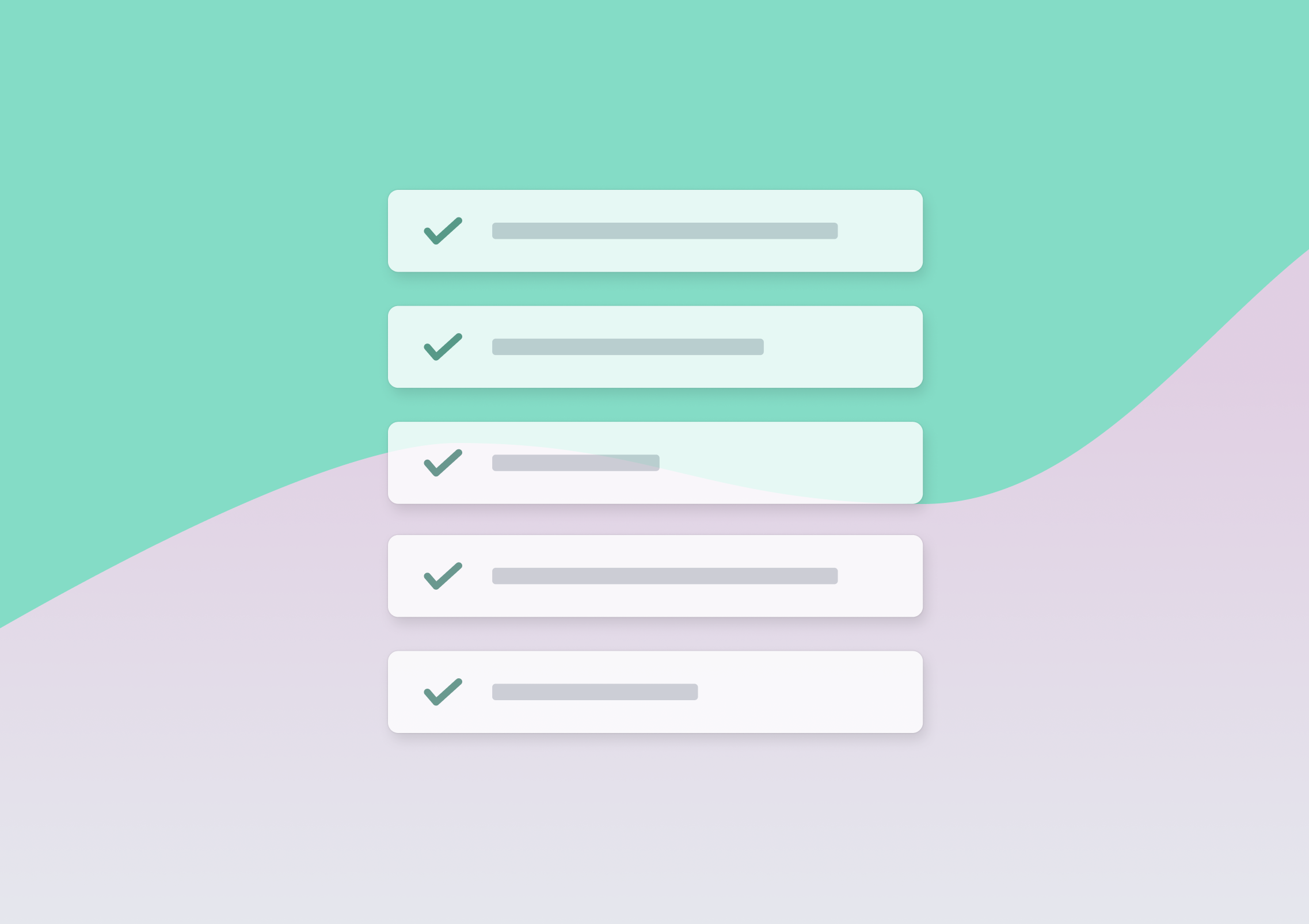
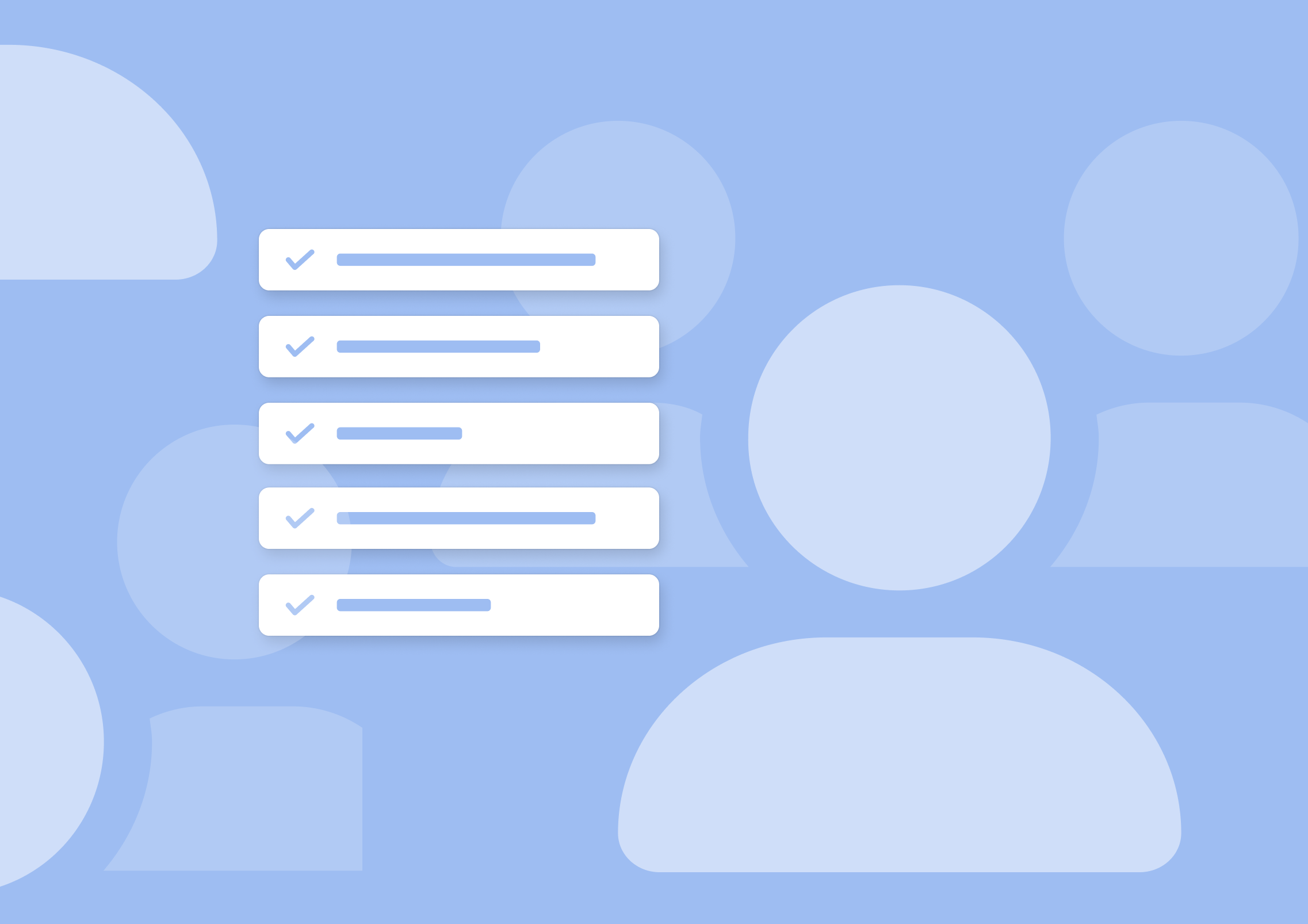
8 In-app Messaging Best Practices for Better UX and User Engagement
It seems logical, doesn’t it? Then again, I see companies removing the exit button time and time again.
And sure, there are situations where it makes sense to do so.
You might be sending users an important legal announcement and need them to take action – Like to agree to changes you’ve made to the legal agreement, for example. In this case, removing the exit button ensures that the user will read and act on the message and won’t click it off mindlessly without even a bit of consideration.
After all, as Nielsen Group points out in this research:
“People have grown accustomed to seeing premature pop-ups on websites and usually ignore them or immediately look for the fastest means by which to close the popup to return to their task.”
So, it makes sense to disable that option in case of highly sensitive and critical messages.
But that’s not the case with most in-app messages.
These notifications aren’t required for a person to see and peruse, and you need to give them a way to dismiss them if they want to.
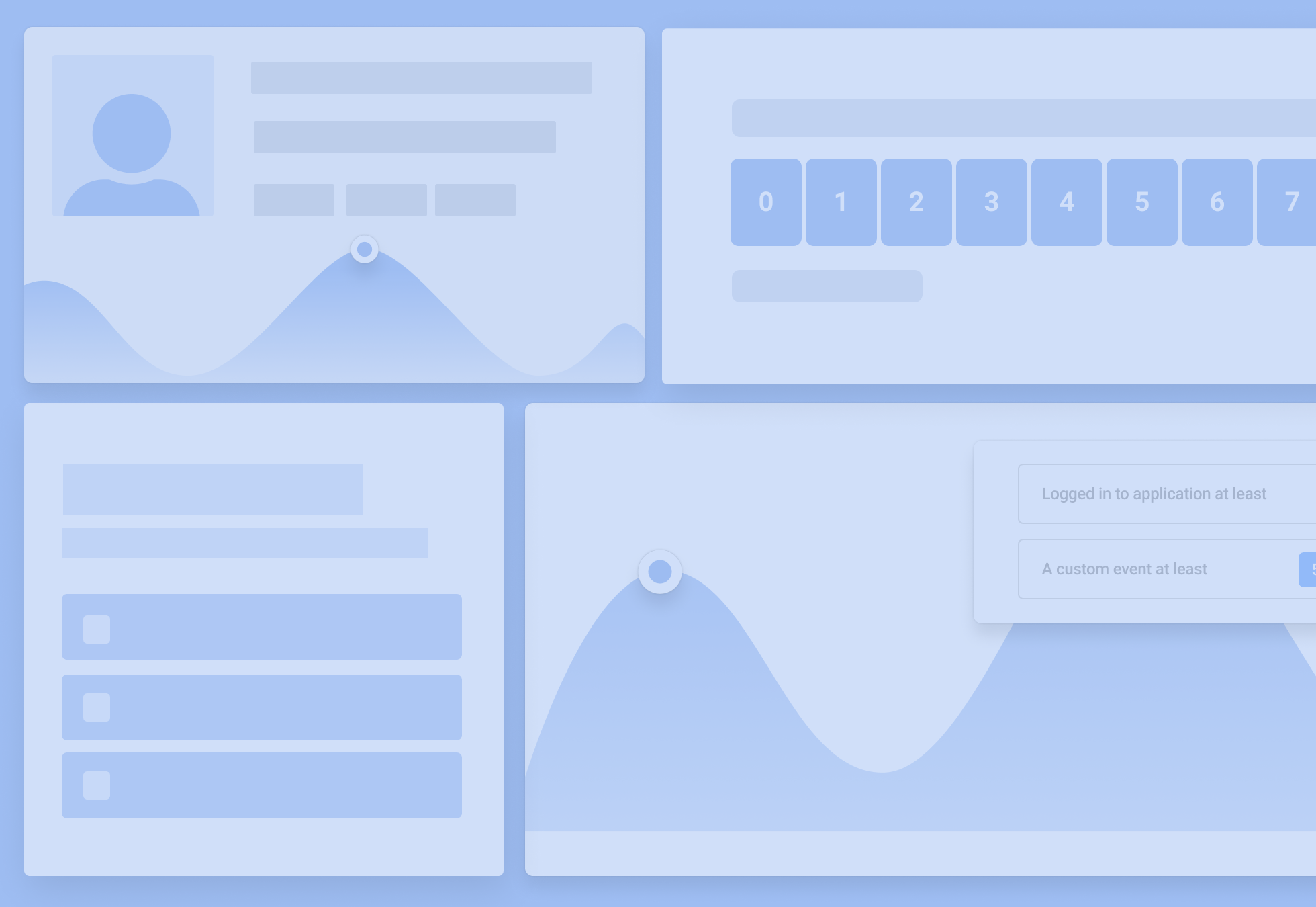
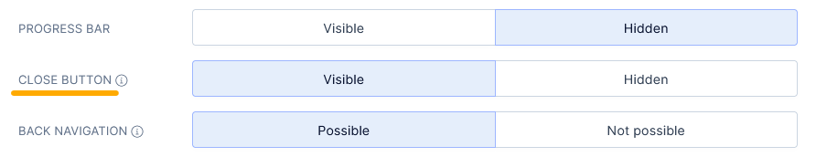
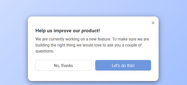
TIP: Most in-app messaging tools, like my product – Refiner – include the option to hide the button.
In the case of Refiner, at least, the option is set to Visible by default. A user must change it manually to disable the close button.
#2. Use on-brand design, but ensure that it’s in contrast to the rest of the app
This best practice helps overcome two specific challenges with in-app messaging.
- The first one is ensuring that the notification looks like it came from you and not like an ad.
- The other one is that the message is also noticeable and attracts enough attention without negatively impacting the user experience.
Both of these issues can have serious consequences for your product.
In the case of the first challenge, the consequences are obvious. People hate ads, after all. We see too many ads, too. And in most cases, advertisers don’t let go.
In fact, according to Hubspot, 91% of us believe that ads now are more intrusive than even two or three years ago.
But what’s that got to do with in-app notifications? Well, unless you style them properly, these messages might end up looking like ads, and users might start confusing them for such. This is particularly true for in-app messages you display in the center of the screen.
Make them too flashy, and users will start thinking that you’ve started selling advertising in the app.
I did a quick test this morning and searched Google for information on mobile ads. Look at the People Also Ask results the search engine returned.
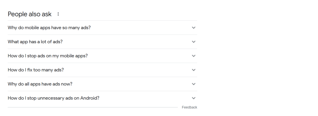
Granted, this is not a proof of anything. But I’d say that does indicate the sentiment we have in relation to ads in mobile apps.
The thing is – Whether your in-app message looks like an ad or not depends almost entirely on its design.
So, make sure that you design it to look on-brand. This doesn’t mean using the exact same color scheme as your app (more on this in just a moment, actually.) But it does mean keeping it close to it, and making it look like a notification, not a promotional message.
As for the other challenge…
Well, I’m sure you don’t display the message just for the sake of it. You want users to notice it, and consume whatever information you share with them.
But for that to happen, they need to notice it first, and that’s where things like color schemes and notification structure come into play.
For example, if you use the same color scheme as your app’s interface, you risk the notification blending in too much with the rest. Adding a bit of contrast, along with a strong and visible headline, might be just enough to attract attention without jumping out at the user simultaneously.
Here’s a negative example. This notification uses a color scheme that’s too close to the background behind it. As a result, it blends in with it, making some of the body copy harder to read.
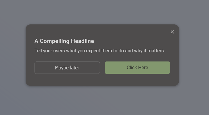
And here is the same notification but set in colors contrasting with the background.
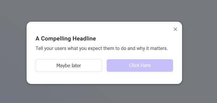
See the difference?
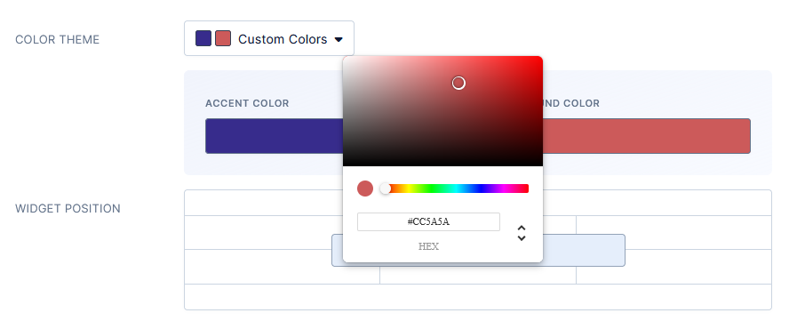
TIP: You can easily create custom color schemes for your notifications and even have different schemes for different types of notifications.
This is what this option looks like in Refiner.
#3. Avoid message overload
This is an easy (but totally wrong) assumption to make:
Since we consider whatever information we include in the in-app message important, it only makes sense to send it repeatedly until every user “gets it.”
Right?
Well, I’ve already called it a wrong assumption, so you know that it’s not something you should be doing.
Sending the same message over and over or sending too many in-app notifications one after another will lead to one thing only – message overload.
Your users will eventually get so tired of seeing those notifications pop up that they’ll learn to dismiss them instinctively without even looking at the message.
So, what to do instead?
Well, leaving aside the obvious – Don’t send the same message more than once – you can do several other things to ensure your users won’t burn out seeing your messages.
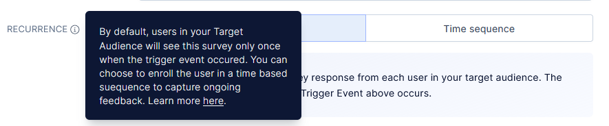
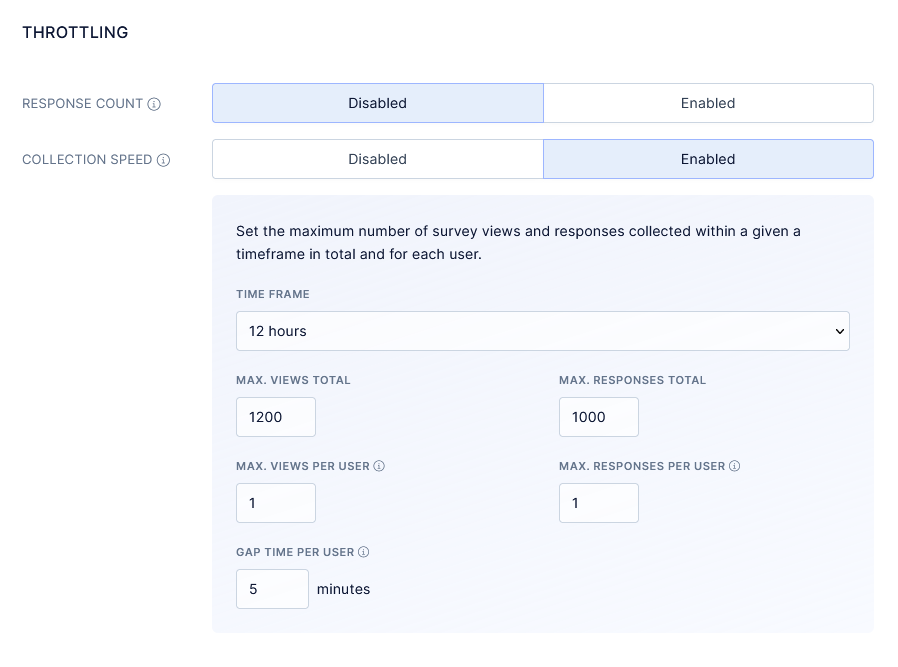
Set Recurrence to one-time only. This way, each user will see the message only once.
In the case of in-app surveys, you can also restrict the number of responses and define the collection speed. You can also restrict how many times a person can respond to the same survey, which ultimately will prevent it from being shown to them after they’ve completed it.
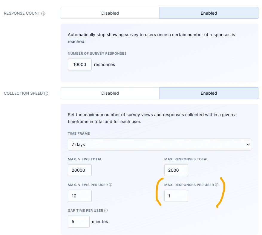
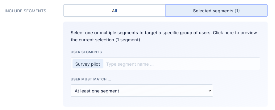
Segment the audience. This will show in-app messages only to the right users.
Speaking of user segmentation…
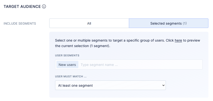
#4. Don’t show all messages to everyone
Granted, some messages are for everyone. But not all of them.
All users would, most likely, want to know about a new feature. But not all of them need help with getting started with your product. Some would be far too advanced to learn about the basics, after all.
Similarly, not all customers would be struggling with new features, and also, not all are likely to convert to a higher price plan.
In general, whether you send the message to an audience segment or all users depends on the message type and its content.
- An onboarding message is for new users.
- A quick tip on using a feature could appear only to users who haven’t used that feature in a while.
- If you’re displaying a new feature notification, then the message will appear for all users. So would an event reminder a maintenance alert, and so on.
So overall, always consider which users are the most likely to be interested in your notification. Consider who’d benefit from the information the most, and see if you can segment your audience to display it to those people only.
TIP: Use behavioral insights to set up custom, data-driven segments and quickly build lists of specific users that you want to reach.
#5. Don’t display notifications mid-session
I do realize that this best practice makes little sense at first. Mid-session would actually be the best time to display an in-app message, right? The person’s well-settled in their routine in the product, they’re working away and are, most likely, quite focused on what’s happening in the product.
There doesn’t seem to be a better time to engage them with a notification.
Well, actually, it’s quite the opposite, in fact.
Let’s break the argumentation I provided above down to see it.
We already know that mid-session, the person is
- well-settled in their routine
- working away
- And also quite focused on what’s going on in the product.
In other words, they’re doing something. So, would they want to be interrupted?
I highly doubt it.
In fact, any message or notification you display to them then will only disrupt their process and lose their flow. That’s not the user experience you want to be providing.
So, when should you display in-app messages?
My recommendation – Trigger them at the moment the person logs into the app. The person just logged in and hasn’t yet launched into their usual process, and they are quite likely to notice and respond to the message.
There are some exceptions to this rule, though.
- You might decide to trigger in-app surveys with a delay. I still recommend having them pop out at the start of the session. Nonetheless, you might want to delay the survey slightly.
- Some notifications or messages might relate to specific pages or features in the app, and naturally, you should trigger them only when someone lands on those.
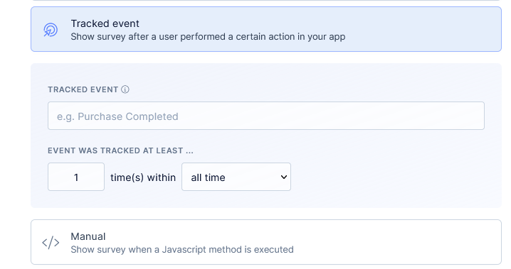
- Similarly, you might be targeting a user segment based on an event (i.e., cancellation survey.) In this case, the in-app message should trigger once the event has occurred.
#6. Keep the body copy short
I admit that it’s not always possible to write a short in-app message.
Then again, sometimes we just think that but in truth, what we display to users could be shorter.
Compare these two messages. They both ask for the same thing – feature feedback.
Yet they do it using two different approaches to copywriting.
Example 1
Example 2
There’s a major difference between them. The first one contains two paragraphs of copy. The other one is just two sentences.
Neither of these messages is wrong, by the way, and I’m not knocking anyone down in this example.
But as a (very happy!) user of the app from the first example, I also have to admit that I haven’t read the entire message. The headline and the button copy were enough to tell me what it was about.
In fact, I only read the full copy when writing this guide and preparing the screenshot as an example.
Now, I agree that being an impatient reader, I might not be a good representative of the average user. Then again, if you consider data like this, maybe I’m not that far off everyone else:
- On the average web page, users have time to read at most 28% of the words during an average visit; 20% is more likely.
Let’s run our example above by this data. There are 59 words in the entire message. I counted, and 20% of that is 11 words.
That’s only 3 words more than the headline and the call to action together!
Based on that, we could deduct that all the rest of the copy could actually be unnecessary, and perhaps even distracting.
Of course, I’m not saying that you should include only the headline and a CTA in your in-app message.
But I’d strongly recommend brevity in your copy.
#7. Consider message placement
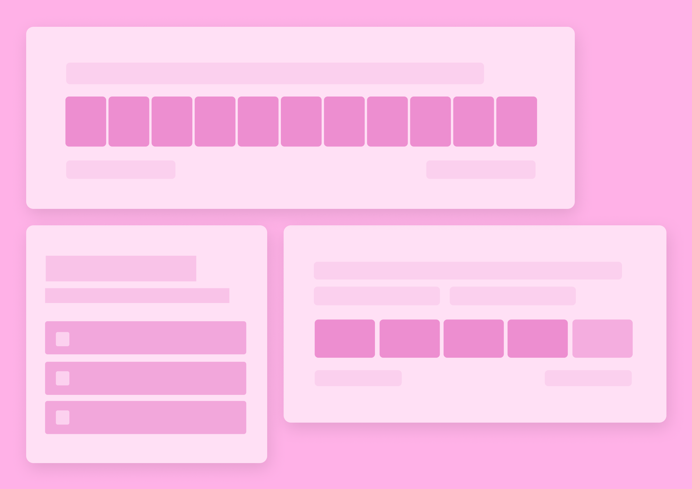
I conducted a small research study last year. My goal was to understand better the factors that affect in-app survey response rates.
You can go through my findings here. And there’s something I’ve found that’s relevant for this guide – The relationship between placement and in-app survey’s success rate.
Take a look at this data.
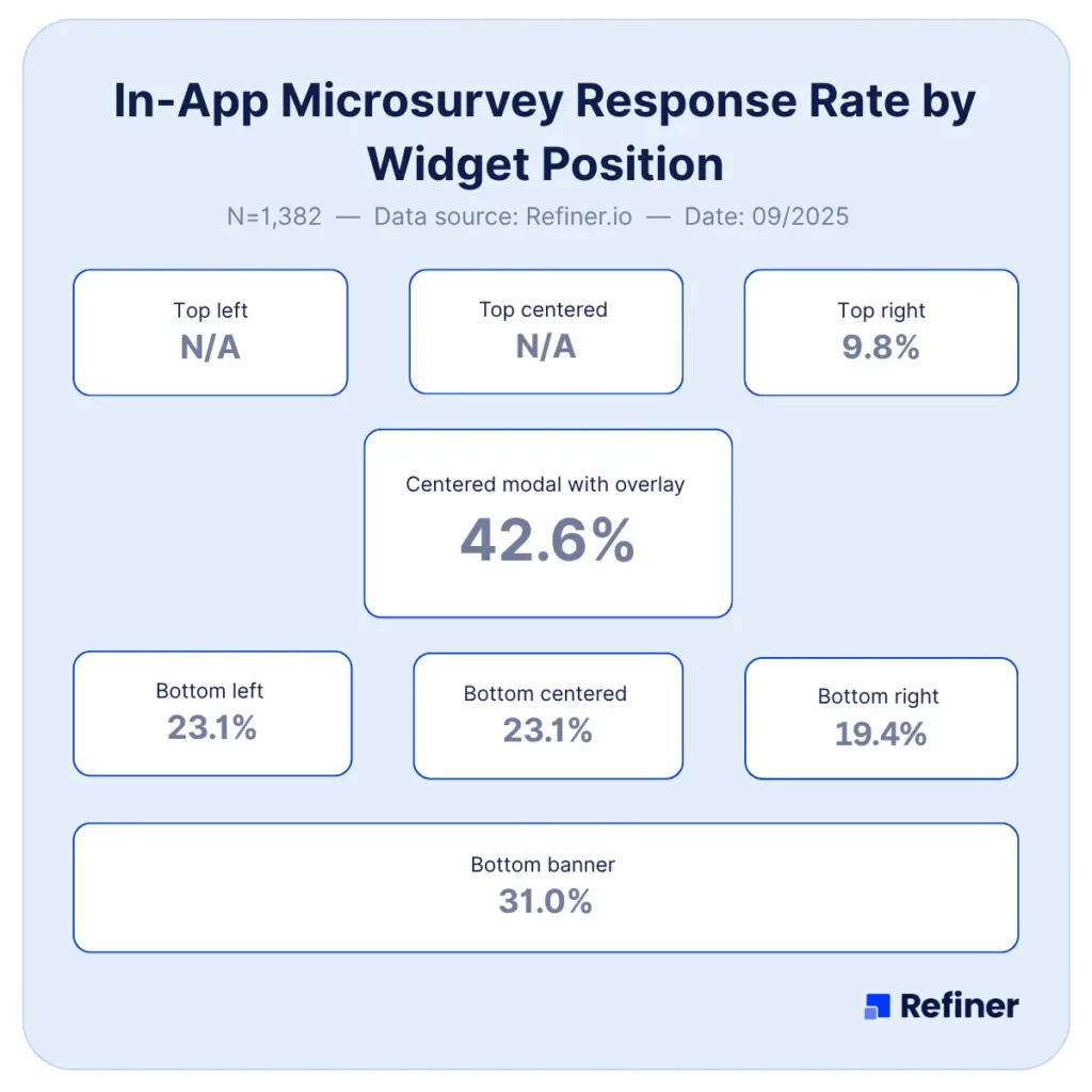
As you can see, the central modal performed the best, generating 42.6% of completion rates, while surveys placed at the top right of the screen fared the worst.
Full disclosure – This research focused on one particular type of in-app messages, microsurveys. And that’s important because, leaving surveys aside, there is one other factor to consider when choosing placement for in-app notifications:
User experience.
In my research, I focused on evaluating which factors contribute to success. In this case, the success was a survey response.
But there is another success factor with onboarding messages, notifications, and other types on in-app messages, and that factor may not have anything to do with the number of users clicking a button, for example.
That factor relates more to delivering the right message at the right time. Or helping users get the product’s value, improving their overall success with the app, and so on.
To achieve a lot of that, you might have to test different placements for your messages. You might also need to use different placements for different message types, and that’s fine, as long as you test different approaches, and pick the one that delivers the biggest engagement.
#8. Test in-app messages before launching them to the entire segment
This is a kind-of “common sense” best practice but that doesn’t make it any less valuable.
You see – It’s quite normal to compose the message and just want to be done with it. Have it go live and pop up for each user. And that’s fine for certain in-app messages, particularly those that do not require users to take any action.
But if you’re sending surveys, promotions, or requests, it’s always better to test how your segment would respond to the message.
TIP: You have several options to test your in-app messaging before launching it to the entire segment or the user base.
You could create a test segment, and trigger the message to that small group of users first.
Or you could throttle the message, run it for a limited time, and set it to display only once per user.
And that’s it…
These are the most important best practices to keep in mind when you’re launching an in-app messaging strategy.
Good luck!
We help SaaS & digital product teams to better understand the needs of their users. Make better product decisions, find upsell opportunities and send ultra-personalized campaigns to retain more customers.
In-app messaging – FAQ
No more than two, and only if they serve a clear purpose aligned with user action.
Use modals for major announcements or updates, tooltips for contextual guidance during tasks.
Yes, segment by behavior, role or lifecycle stage to ensure relevance and boost engagement.
Ensure messages align with user goals, keep them short, limit frequency, honour dismissals and monitor fatigue.
Track views, click‑through, dismissals and conversions like feature use or survey submission.