What is a Customer Effort Score
Look, I know that it’s may sound a little weird to you but it’s 100% true:
People don’t churn from your product because they’re unhappy.
They do so because using it feels like work.
That’s why surveys focused on satisfaction or loyalty — while useful — don’t always tell the full story.
And that’s where Customer Effort Score (CES) comes in. It cuts through the noise and asks the one thing that actually matters:
“How easy was it to get what you came for?”
Whether it’s using your product, getting help, or completing a task — customer effort score tells you what satisfaction can’t.
It shows you where things break, where users get stuck, and where you’re making life harder than it needs to be.
And when you fix those things?
Your customers stick around. Your support load drops. Your growth engine gets smoother.
In this guide, I’ll break down:
- What CES is (and what it’s not)
- When to use it
- How to measure it
- And how to act on it — fast
So, let’s do it.
What is Customer Effort Score (CES)?
This term – Customer Effort Score (CES) – refers to surveys that reveal just one thing: how easy it is for your customers to do what they came to do.
It’s a single-question metric designed to pinpoint friction.
Instead of asking how happy or loyal someone is, you ask:
“How easy was it to [complete a task/interact with support/use our product]?”
That’s it.
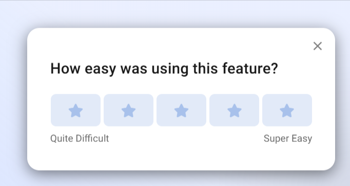
(An example of a CES survey created with Refiner)
In other wrods, CES is not about delight.
It’s about removing pain.
Because when something feels difficult — even mildly annoying — customers don’t forget. For example, according to a Harvard Business Review study, 81% of customers who reported high effort said they would speak negatively about the company to others (source).
And let’s face it, that’s not a UX issue. That’s a (serious) growth problem.
So, CES gives you the data to spot exactly where that effort happens… And you know, maybe it’s a clunky onboarding flow… Or a support process that takes too long… A core feature that feels buried…
Wherever the friction is, CES surfaces it fast — so your team can fix it before it drives people away.
In fact, CES has been shown to be a stronger predictor of future purchase behavior than CSAT or even NPS in certain use cases (source).
Here’s what makes customer effort score survey so powerful:
- It’s immediate. You can trigger the CES survey right after a key action.
- It’s specific. You can use CES surveys to target any part of the customer journey.
- It’s actionable. Because it’s so laser-targeted, any low scores tell you exactly where to dig.
Great, right?
Why CES Matters
Look, I know I am running at a risk of repeating myself but it’s super important…
Most churn doesn’t happen because people hate your product. It happens because using it feels like effort.
That’s what CES reveals — the silent killers of customer experience. Confusing flows. Hidden bugs. Slow responses. Extra steps. The stuff no one tells you about… until they leave.
The data backs this up.
According to Gartner, 96% of customers who experience high-effort interactions become more disloyal. Compare that to just 9% for low-effort experiences (source).
And it’s not just churn. High effort creates ripple effects:
- Customers avoid self-service and flood support.
- Negative word of mouth spreads (81% of high-effort customers say they’d complain to others — source).
- Even loyal users hesitate to upgrade or buy again.
But when things feel easy?
- Customers breeze through onboarding.
- Support tickets drop.
- People actually enjoy using your product — and tell others.
This is what customer effort score helps you find. Not just “what’s broken,” but what feels like work.
NPS tells you how people feel in general. CSAT tells you how they felt right then. CES tells you why they might never come back.
That’s why it matters. Because when you lower the effort, everything else improves — retention, satisfaction, growth.
And you don’t need a massive rebrand to get there. Just fix the moments that feel heavy.
How to Measure CES
Measuring Customer Effort Score isn’t complicated — but doing it well takes some strategy.
That’s because the power of CES comes from context, timing, and follow-through.
So, here are few pointers that will help you get it right.
Start with the core CES question
At its core, CES is a single question survey — but that doesn’t mean you can just ask it the same way every time.
I know that it may be hard to believe but the wording matters.
For one, it needs to match the moment, the context, and relate to what the user just did.
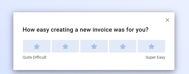
A good CES question should feel like a natural continuation of the customer experience, not a generic formality. It should reference a specific interaction or task so the user knows exactly what you’re talking about.
Think of the difference between:
“How easy was it to use our platform?” vs. “How easy was it to complete your first report using [tool name]?”
The second version makes the feedback more useful — and believe it (or not, of course) easier to act on.
When drafting your CES questions, start by identifying the exact point of friction or experience you want to measure.
- Is it a support interaction?
- A new feature rollout?
- A completed workflow?
Then ask: “How easy was it to [do the thing]?”
Some companies even A/B test phrasing based on user type — for example, technical vs. non-technical audiences — to make sure the language resonates.
This might sound subtle, but it has a big impact. When a question feels tailored and relevant, customers are more likely to respond — and give honest, detailed input.
The default CES question looks like this:
“How easy was it to solve your issue today?”
Or, adapted for product usage:
“How easy was it to complete [X task] using our product?”
Here are few more real-world examples:
- After support: “How easy was it to get the help you needed today?”
- After onboarding: “How easy was it to get started with [product name]?”
- After feature usage: “How easy was it to use [feature]?”
Choose your response scale
Most CES surveys use either a 5-point or 7-point Likert scale. It’s a simple structure where users rate their experience from “very difficult” to “very easy.” The goal is to quantify ease in a way that’s intuitive, fast, and comparable over time.
For example:
1 (Very difficult) to 7 (Very easy)
A 5-point scale is great when you want quick reads — especially for embedded surveys in mobile apps or when survey fatigue is a concern. It reduces friction and speeds up completion.
A 7-point scale gives you more granularity. It’s ideal when you’re looking to track subtle shifts in user experience or identify emerging patterns across larger data sets. The extra points help distinguish between “somewhat easy” and “very easy,” which can be useful when digging into product-level friction.
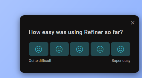
Some teams also experiment with icon-based or emoji scales — especially when targeting mobile users or consumer audiences. For example, sad-to-happy faces, or thumbs down to thumbs up. While not traditional, these work well in the right UX context, especially for real-time in-app feedback.
Whatever scale you choose, keep it consistent. Changing it too often makes trends hard to track. And don’t forget to define what each number or icon means internally — it helps when interpreting results later, especially if you’re sharing the data with multiple teams.
When and where to ask CES
CES works best when it’s tied to a specific moment in the customer journey — right after the user completes an important task or interaction. Why? Because that’s when their perception of effort is the freshest. Wait too long, and the experience blurs. Ask too soon, and they haven’t done enough to form an opinion.
The most effective CES surveys are triggered contextually. For example:
- Right after a user submits a support ticket and gets a resolution
- Immediately after a checkout or payment confirmation
- Once onboarding is complete
- After engaging with a newly launched feature
Let’s say you’ve just launched a new dashboard experience. Instead of emailing users a CES survey days later, you embed a short CES pop-up directly after they explore the new dashboard. That gives you instant feedback on how intuitive it felt — and how much effort it required.
Timing isn’t the only factor. Placement matters too. In-app CES surveys tend to outperform email versions in terms of response rate — because they catch users in the flow. You can place them in tooltips, modals, or slideouts, depending on your product design.
CES works best in the moment. Send the survey immediately after a key action — not hours or days later.
Common triggers:
- After closing a support ticket
- After a user completes a purchase
- After someone finishes onboarding
- After trying a new feature for the first time
Scoring your CES responses
You’ve collected CES responses — great. But now what? It’s time to turn them into a number you can track, analyze, and act on.
There are two primary ways to score CES, and both can be useful depending on your goals.
1. Average score method This is the most straightforward approach. You simply take the mean of all responses. If your survey uses a 7-point scale, and your scores are 6, 5, 7, 6, and 4, the average CES score would be 5.6.
This method is ideal for spotting trends over time. You can plot weekly or monthly CES averages and track how product changes, support improvements, or onboarding tweaks impact customer effort.
But there’s a catch: average scores can mask issues. If half your users score you a 7 and the other half a 3, the average might look healthy — while real problems go unnoticed.
2. % of positive responses method This approach splits responses into “low effort” and “high effort” categories. A common rule of thumb:
- Scores 5–7 = low effort
- Scores 1–4 = high effort
Then you calculate the percentage of users who rated the experience as low effort. If 80 out of 100 responses fall in that range, your CES success rate is 80%.
This method makes it easier to communicate across teams. It’s more intuitive — especially for execs who want to know, “How many of our customers thought this was easy?”
Some teams go further and calculate a CES delta after a change, comparing the pre- and post-launch percentage of low-effort responses. That’s a great way to measure if you’re actually reducing friction.
Bonus tip: Don’t just stop at scoring. Layer in qualitative feedback from follow-up questions. A score tells you there’s a problem. Comments tell you why.
In practice, it’s smart to use both methods: average for trend analysis, percentage for reporting clarity. Together, they give you a fuller picture of what your customers are dealing with — and how that’s shifting over time.
What’s a good CES score?
There’s no single number that defines a “good” CES score across the board. What’s considered strong in one industry could be average in another. That said, most companies using a 7-point scale generally see a CES of 5.5 or higher as healthy. Anything below 4.0 is usually a sign of friction — and a reason to dig deeper.
But don’t treat CES like a test where you’re chasing a perfect grade. It’s not about hitting a magic number — it’s about seeing how effort changes over time and how it varies across segments of your users.
For example:
- You launch a new onboarding flow, and your CES jumps from 5.2 to 6.0. That’s a win.
- You roll out a feature redesign, and CES drops from 6.3 to 5.4 — time to investigate.
Trends matter more than raw numbers. You want to look for movement — especially when tied to specific product or support changes.
Also keep in mind that expectations shift. A CES of 5.8 might be great for a B2B CRM tool with lots of complex functionality. But that same score might raise eyebrows in a consumer app where ease-of-use is everything.
Bottom line: Benchmarks are helpful. But your best benchmark is yourself. Track CES over time, compare it across product areas, and most importantly — use it to guide decisions that reduce friction and make your product easier to love.
Pro tip: Segment your results
One CES score doesn’t tell the whole story.
You could have an average CES score of 5.6 and still be leaking customers — not because your experience is bad overall, but because one segment is quietly struggling.
That’s why segmentation matters.
When you break CES results down by key variables — like user type, journey stage, or feature usage — patterns start to emerge. And those patterns are what lead you to real, actionable fixes.
Let’s say you run a SaaS tool:
- Your overall CES score is strong.
- But when you isolate responses from new users, the average drops significantly.
- You dig deeper and discover that your onboarding emails aren’t reaching certain email clients. Boom — now you know what to fix.
Or take this one:
- A new feature just launched.
- CES results for that feature show high effort only on mobile.
- Turns out, a small UI bug was making a key button unclickable for Android users.
Without segmentation, both of these would’ve been invisible.
Here are a few ways to segment CES:
- User lifecycle: New vs. returning users
- Plan type: Free vs. paid vs. enterprise
- Feature set: Which feature or product area triggered the survey
- Device/platform: Web, iOS, Android
- Region: Especially important if support or content is localized
Most modern CES tools — like Refiner — let you tag responses automatically based on metadata or survey triggers. So you’re not doing this manually.
The goal is to stop looking at CES as one number. Instead, think of it as a signal that helps you zoom into the moments and users that need your attention most.
That’s how you turn feedback into fixes. And friction into growth.
- By user segment (e.g. new vs. experienced)
- By feature or touchpoint
- By device type or location
That’s when you see the patterns that lead to real fixes.
Common Pitfalls to Avoid with CES
Using CES sounds simple — and it is. But many companies still get it wrong. They collect effort scores but fail to act on them. Or they sabotage their own insights with bad timing, poor framing, or meaningless follow-up.
Here are the most common mistakes — and how to avoid them:
1. Asking too generally
A CES survey works when it’s specific. “How easy was it to use our platform?” is too broad to be actionable. Users might think about anything — your dashboard, your billing process, your help center. You’ll end up with noise.
Fix: Ask about a specific task. “How easy was it to create your first report?” Or “How easy was it to get help with your issue today?”
2. Sending the survey too late (or too early)
Timing is everything. Ask too early, and the user doesn’t have enough experience to judge. Ask too late, and the memory is gone.
Fix: Trigger surveys immediately after key actions — completing onboarding, using a feature, getting support. That’s when you’ll get the most accurate responses.
3. Skipping the follow-up question
CES without context is just a number. It tells you something was hard. But not what.
Fix: Always ask a quick follow-up like “What made this easy or difficult?” Even a sentence of feedback can uncover issues you didn’t see coming.
4. Focusing only on the average score
An average CES of 5.5 might look fine — but it could be hiding huge variance. You might have a batch of 7s and a cluster of 2s.
Fix: Break down your scores. Look at trends, segment by user type, and identify outliers.
5. Not acting on the data
This is the big one. CES is only useful if it drives change. Too many teams collect the data, create a dashboard — and do nothing with it.
Fix: Create a feedback loop. Assign owners. Review CES results weekly. Prioritize improvements based on where the biggest friction is.
6. Using CES in the wrong context
CES is great for measuring specific interactions. But it’s not a replacement for NPS or CSAT. Don’t ask CES in situations where the user hasn’t just completed a task or touchpoint.
Fix: Use CES as part of a broader feedback strategy. It’s not “either/or” — it’s “and.” Use CES to find friction, CSAT to gauge satisfaction, and NPS to track loyalty.
7. Not educating your team on what CES means
Not everyone on your team may understand what CES measures — or how to use it.
Fix: Train your teams. Make sure product, support, and growth all understand the value of CES and how to use the insights to drive real improvements.
Avoid these mistakes, and CES becomes more than a metric — it becomes a lens into what’s slowing your growth.
And once you know where people are struggling? Fixing it becomes the fastest path to better retention, happier users, and a more effortless product.
Conclusion
If you want customers to stick around, stop making them work for it. CES helps you find what’s hard — so you can make it easy.