In-app Messaging: The Ultimate Guide
Let’s not beat around the bush here: There really is no better way to engage users as they’re using your app than dropping an in-app message on them.
No, really!
Think about it – In-app message is direct.
It’s timely.
And let’s face it, it doesn’t have to compete with 48 unread emails or a dozen browser tabs (or anything else, at that.)
But here’s the catch: most companies still get in-app messaging wrong.
They overuse it. Or underuse it. Or worse—treat it like a push notification.
Yikes.
But in-app messaging isn’t just about pushing a feature or shouting about an update. Done right, it guides users, nudges behavior, and builds momentum inside the product.
Let me show you how.
What Is In-App Messaging?
In-app messaging refers to any message you show to users while they’re inside your product. Not on their phone lock screen. Not in their inbox. Right there, inside the app.
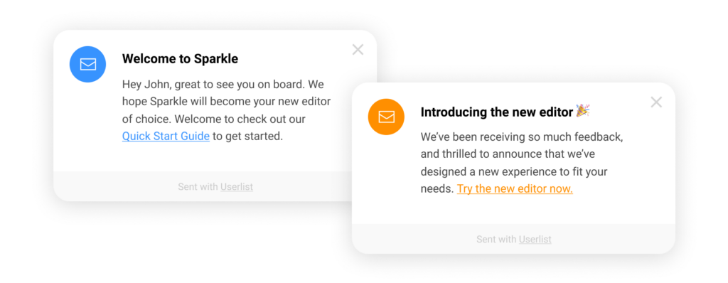
That could be a welcome message when someone signs up. A tooltip guiding them to use a feature. A banner announcing a new integration. Or a modal nudging them to upgrade.
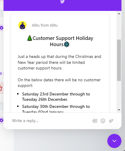
What matters here is context. These messages show up based on what the user is doing or where they are in the product journey. They’re timely, targeted, and designed to move users forward.
Unlike push notifications, in-app messages aren’t trying to bring users back. They’re trying to help users do something right now.
Why In-App Messaging Matters
Let me be blunt (again!):
If you’re not using in-app messaging to engage your users, you’re leaving value on the table.
It really is that simple.
Here’s why.
Users are most open to nudges and prompts when they’re actively using your product. Not an hour later in an email. Not three days later in a push. Right there, in context.
In fact, research from Localytics showed that in-app messages can boost user retention by up to 3x compared to apps that don’t use them at all (source). And when personalized, those messages see click-through rates north of 30%.
Insane, right?
Now try getting that from a cold email…
But more importantly, in-app messages let you speak to users at moments that actually matter.
- A new user logs in for the first time? Trigger a welcome message or onboarding tour.
- Someone’s hovered over a new feature but never clicked? Drop a subtle tooltip nudging them to explore.
- A loyal customer hits a usage milestone? Celebrate it with a custom modal or banner.
That’s what makes in-app messaging so powerful. It’s behavior-driven, not blast-driven.
And that fits perfectly with modern product-led growth strategies. You’re not guessing what to say or when to say it. You’re reacting to what users are doing—and helping them move one step closer to value.
Email and push still have their place, of course. But they’re interruptions. In-app messaging? That’s a conversation happening right inside the product.
That’s where you win trust. That’s where you guide action. That’s where you drive adoption.
Types of In-App Messages
In-app messaging isn’t one-size-fits-all. Different messages serve different goals—and knowing when to use which type is half the battle. Here are the most common types of in-app messages you should know about:
Modals: The classic popup. Full attention, full interruption. Great for onboarding steps, upgrade prompts, or urgent messages—but use sparingly. Nobody wants a modal overload.
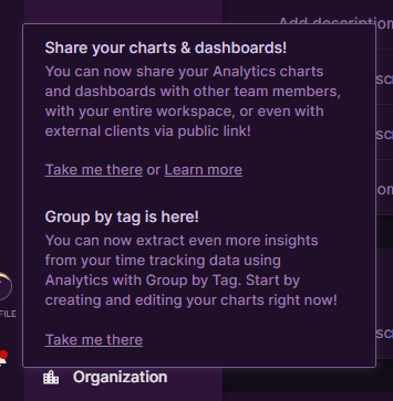
Tooltips: Small, contextual hints that point users in the right direction. Perfect for product tours or feature discovery. They’re subtle, but powerful.
Banners: Usually pinned to the top or bottom of the screen. Ideal for announcements (think new features, outages, or scheduled maintenance). Low friction, always visible.

(In-app message banner)
Slide-ins: Messages that slide into view from the side of the screen. These strike a good balance between visibility and subtlety. Great for engagement nudges or feedback requests.
Full-screen takeovers: High-impact. Best for walkthroughs or big updates. Use them when you want to control the entire experience for a moment—like at first login.
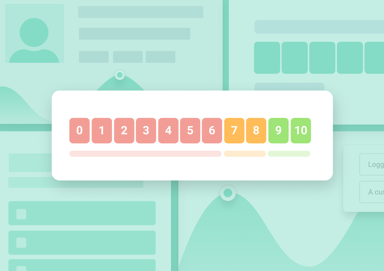
Surveys and Forms: Embedded feedback collection tools like NPS, CES, or quick polls. You can ask the right question in the right moment, and actually get a response.
Choosing the right message type depends on two things: what you want the user to do—and how disruptive you’re willing to be.
And yes, “least disruptive, most useful” is usually the right answer.
When to Use In-App Messaging
The short answer? When context is king.
In-app messages shine when they show up in the moment—while the user is already engaged, active, and primed to take action. But not every moment is equal. Here’s when you should absolutely be using in-app messages:
1. Onboarding New Users
You only get one chance to make a first impression. In-app messages are your chance to guide users through the early steps: showing them where to go, what to do, and how to see value fast.
Use:
- A welcome modal with a short product tour
- Tooltips that explain key features
- Slide-ins that nudge toward the next step
🔍 Example: Slack uses a series of tooltips to highlight key features like channels, threads, and integrations—making sure new users don’t get lost.
2. Announcing New Features
Email open rates are fine. But if a user logs in and doesn’t know about a new feature, that’s a missed opportunity.
Use:
- Banners for subtle announcements
- Modals if it’s a major feature release
- Tooltips to guide usage
📈 According to Pendo, companies that highlight new features in-app see 40–60% more feature adoption within the first week.
3. Triggering Behavior-Based Nudges
Behavioral nudges are where in-app messaging really starts to shine. If someone visited a feature multiple times but didn’t activate it? That’s a perfect moment.
Use:
- Slide-ins to nudge action
- Tooltips with targeted guidance
🎯 Example: Grammarly uses smart prompts when it detects you haven’t used a tone-check or premium feature that’s relevant to your workflow.
4. Collecting Feedback
Don’t wait for the user to leave your app to ask how things are going. Ask while they’re still using it.
Use:
- CES after feature use
- NPS for power users
- Short 1-click surveys post-onboarding
🗣️ According to Wootric, collecting feedback at the right in-app moment can increase response rates by up to 7x compared to email.
5. Driving Upgrades or Monetization
Not every upgrade prompt belongs in a modal. But if someone’s hit their usage limit or keeps interacting with a gated feature, that’s a conversion opportunity.
Use:
- Slide-ins for gentle nudges
- Modals when there’s urgency or value to highlight
💡 Example: Canva offers contextual prompts when users try to download premium assets—creating upgrade moments that feel natural, not forced.
6. Celebrating Milestones
Recognition builds loyalty. It also feels good.
Use:
- Banners or modals to mark usage milestones
- Fun animations or congratulatory messages
🙌 Whether it’s “100th note created” or “1-year anniversary,” a little acknowledgment goes a long way.
Bottom line: In-app messages should always feel relevant, timely, and helpful. They work best when they match the user’s intent—not interrupt it.
That’s the secret to making them feel like part of the product—not noise.
How Refiner Helps You Push Better In-app Messages to Users
Refiner (disclaimer – this is my product) is built for SaaS and digital product teams who want to engage users inside the product, not just blast them with emails or push notifications.
With Refiner, you can trigger beautifully designed, no-code messages—think surveys, announcements, or upgrade nudges—based on real user behavior.
Want to show a tooltip only to new users who skipped onboarding? Easy.
Need to launch an NPS survey after someone completes a key workflow? Done.
You can also segment audiences, set precise triggers, and throttle message frequency to avoid overwhelming your users.
Plus, Refiner integrates seamlessly with tools like Segment, Mixpanel, and HubSpot, so your messages are always in sync with your user data. And with built-in analytics, you’ll know exactly which messages are driving engagement—and which ones need a tweak.
Bottom line: Refiner helps you deliver the right message, to the right user, at the right time—without annoying them. That’s how you turn in-app messaging from a nuisance into a growth engine.
Common Mistakes to Avoid
Let’s be honest—most bad in-app experiences come down to a few avoidable missteps. Here’s what to look out for (and what to fix fast):
1. Blasting Everyone with the Same Message
In-app messaging isn’t about quantity—it’s about relevance. One of the most common mistakes? Sending the same message to every user, regardless of who they are or what they’ve done.
A generic message might sort of make sense to some users—but it’ll feel random or even annoying to others. Picture this: a user on your free plan gets prompted to “explore enterprise features.” Or a new signup gets an upsell message before they’ve even activated a single feature. That’s not just ineffective. It’s frustrating.
✅ Fix: Segment, segment, segment. Tailor your messages based on user type, lifecycle stage, and behavior. If someone’s used a feature three times, speak to that usage. If they’ve never touched it, guide them there gently. Modern messaging tools make this easy. There’s no excuse for a one-size-fits-all blast.
2. Showing Messages Too Early (or Too Late)
Timing isn’t just a nice-to-have—it’s everything. Show a message too early, and users will dismiss it before it registers. Too late, and the moment of intent is long gone.
Say someone logs in for the first time and gets a modal pushing them to upgrade before they’ve even seen the product. What are they supposed to do with that? Or worse—someone tries a new feature three times, but the helpful tooltip only shows up after they’ve given up.
✅ Fix: Tie messages to events, not time. Use logic like “user clicked X but didn’t complete Y within 10 minutes” to surface relevant nudges. Behavior-driven timing means the message shows up when it makes sense, not just when the system says so.
3. Overdoing It
Just because you can show ten messages doesn’t mean you should. Nothing kills trust faster than bombarding users with banners, modals, tooltips, and slide-ins all in one go.
It’s like being trapped in a product with a dozen chatty sales reps shouting over each other. The result? Cognitive overload, decision fatigue, and a strong urge to hit “X.”
✅ Fix: Implement message caps and prioritize the most important actions. One high-value message per session is a solid rule of thumb. Make every message earn its place—if it’s not useful, cut it.
4. Using Vague or Generic Copy
You’ve seen it before: “Check this out!” or “New feature available!” That’s not messaging—it’s noise. Without context, users have no idea what they’re being asked to do or why it matters.
Good copy does more than inform—it motivates. It connects the feature to a benefit. It reduces uncertainty. It makes taking action feel obvious.
✅ Fix: Write like a human who actually wants to help. Instead of “Try our new dashboard,” say “Visualize your usage trends with the new reporting dashboard—now live.” Add clarity, not cleverness.
5. Ignoring Mobile Optimization
Your messages might look gorgeous on desktop—but are they readable on a phone? If you’re forcing users to pinch-zoom a modal or tap a 6px “close” button, you’ve already lost them.
Mobile users expect smooth, native-like experiences. Misaligned content, awkward positioning, or inaccessible interactions can kill engagement—and trust.
✅ Fix: Test every message on mobile devices. Use platform-specific layouts, and keep content concise. Buttons should be easy to tap. And yes, let users dismiss with a swipe.
6. Forgetting to Measure Performance
You wouldn’t launch a marketing campaign without tracking results. Why treat in-app messaging any differently?
If you’re not measuring message views, dismissals, CTR, and downstream actions, you’re just guessing. And without data, there’s no way to know what’s working (or what’s annoying users).
✅ Fix: Set clear goals for each message—click, conversion, or feedback completion. Use A/B testing to compare versions. And always monitor outcomes so you can iterate and improve.
Avoid these mistakes and you’re already ahead of 90% of teams. Because great in-app messaging doesn’t just happen. It’s designed, tested, and constantly refined.
Frequently Asked Questions
What’s the difference between in-app messaging and push notifications?
The main difference lies in where and when each type of message is delivered. In-app messaging appears while the user is actively using your product—inside your app or web platform. Push notifications, on the other hand, are sent outside the app to bring users back in.
In-app messages are contextual and immediate. They appear while the user is completing tasks, exploring features, or interacting with your product. That makes them perfect for guiding behavior, nudging conversions, or offering support in real time.
Push notifications are better suited for re-engagement. They’re great for alerts, reminders, and pulling users back after inactivity—but they’re also easier to ignore, especially when users get dozens of them daily.
Use push to drive sessions. Use in-app to enhance them.
Can in-app messages replace email onboarding?
Not entirely—but they can seriously boost it.
Email onboarding has its place. It’s good for setting expectations, sharing broader context, or providing backup when users drop off. But it relies on someone leaving your app and checking their inbox—something that might not happen as often (or as quickly) as you’d like.
In-app messages, on the other hand, meet the user in the moment. You can guide them through the exact step they’re on, celebrate progress, or resolve confusion before it leads to churn. That level of contextual help is what makes in-app messages more actionable and often more effective.
The best onboarding flows use both: email for high-level nudges, and in-app for step-by-step guidance.
How do I know if my in-app messages are working?
Measure them like any other part of your product.
Start by tracking basic engagement metrics—views, clicks, dismissals. But don’t stop there. Dig into what happens after the message. Did users complete the action? Did they activate a feature? Did NPS or CES scores improve?
A/B testing is your friend. Try different formats, timing, CTAs, and content. For example, does a tooltip perform better than a banner? Does a softer CTA convert better than a direct ask?
Use those insights to iterate. The best teams treat in-app messages like a product: built, measured, and improved continuously.
How often should I show in-app messages?
Less than you think. But more strategically.
There’s no magic number—but if your user sees more than one or two messages per session, it’s probably too much. Overexposure leads to message fatigue, banner blindness, and dismissals without engagement.
Instead, focus on relevance and timing. Show messages based on behavior, not the clock. Use segmentation to deliver only what matters. And cap the number of messages a user sees in a day or week.
If your messages are genuinely helpful and well-timed, users won’t mind seeing them. But the second they feel spammy or intrusive, you’ve lost trust—and maybe the user.
Do in-app messages work for B2B products?
Absolutely—sometimes even more than in B2C.
B2B users often have more complex workflows, longer onboarding times, and higher stakes when using a product. That makes in-product guidance not just helpful—but critical.
You can use in-app messages to:
- Walk users through new tools
- Introduce role-based functionality
- Trigger upgrade nudges based on usage
- Collect contextual feedback on features
Plus, when multiple users from the same company are onboarded together, in-app messaging keeps the experience consistent and scalable.
If your B2B product relies on user activation, feature adoption, and expansion revenue (and let’s face it—most do), then smart, well-timed in-app messages are a no-brainer.
