How to Improve In-App Survey Response Rates: Benchmarks, Triggers, and 14 Proven Tactics
TL;DR
- A healthy in‑app survey response rate is 25%–30%. Refiner’s 2025 data averages ~27% response and ~24% completion when timing, targeting, and native UI are dialed in.
- Biggest lifts come from meaningful triggers, behavioral segments, 1–2 questions, native design, and frequency caps.
- Count it right: response = submissions ÷ unique views. Track completion separately. Measure in a fixed window so you can compare apples to apples.
- Place surveys after success, not mid task. Start with one‑tap inputs and add a short why this helps line.
- Use proven playbooks: NPS at day 10+, CSAT on solved screens, feature polls after second use, onboarding right after setup.
- Close the loop and show improvements. Participation rises and stays high.
Response rate isn’t a mystery. It’s just math disguised as UX. Really. And believe me, when you treat it like that, the numbers go up.
Of course, this sounds fine and dandy in theory. It’s how you actually do it that’s a real mystery?
My secret? I zero in on three things: I ask at the right moment, ask the right people, and make it effortless to answer. Everything else is just noise.
In this guide, I’ll show you exactly how to do it, and lift your in-app response rates.
You’ll learn the levers, the settings, and the copy. We’ll also clean up the math, define the right denominator, and separate response rate from completion.
We have a lot to cover so, let’s take it from the top…
Quick answer: What is a good in-app survey response rate?
For most products, a healthy in-app response rate sits between 25% and 30%. In our own research, we discovered the average response rate to land around 27% response with ~25% completion when timing, targeting, and UI are dialed in. If you are below 10% consistently, you likely have a timing, targeting, or UX issue.
Fast levers to lift response
- Trigger after meaningful actions, not at random
- Keep it to one or two questions, tap to answer
- Match your product’s look and feel, avoid jarring popups
Benchmarks at a glance
Now, ours isn’t the only research into in-app response rates. So, below I’ve compared our findings with other, similar research.
| Source | Year | Channel | Reported metric | Notes |
|---|---|---|---|---|
| Refiner study | 2025 | In‑app (web and mobile) | 27.52% response, 24.84% completion | 1382 surveys, ~50M views, short surveys and central placement perform best |
| Business of Apps | 2025 | In‑app | 13% response | Aggregated data across apps and verticals |
| Alchemer Mobile | 2022–2023 | In‑app (mobile) | 13% response | Mobile app focus, category variation reported |
| Screeb | 2023 | In‑app | ~12% response | Vendor dataset, web and mobile combined |
Why numbers differ?
There are several factors that, most likely, contributed to this.
Naturally, I can only speak of our research. I don’t know much about the methodology my colleagues used. But from what I gather, the discrepancy is likely due to these factors:
- Different denominators. Some tools divide by all impressions, others by unique views, others by eligible users. If 250 people respond out of 5,000 impressions you get 5%, but if those impressions came from 1,000 unique viewers your true rate is 25%.
- Platform mix. Data that is mobile only will differ from web plus mobile. Mobile can lift response when you use native sheets and one tap choices, but small screens and busy contexts can also depress open text completion. Mixed datasets rarely state the split.
- Survey type and length. One question micro polls and emoji scales attract more responses than 4 plus question flows with open text. NPS and CSAT usually outperform long product research surveys. Each extra field increases drop off.
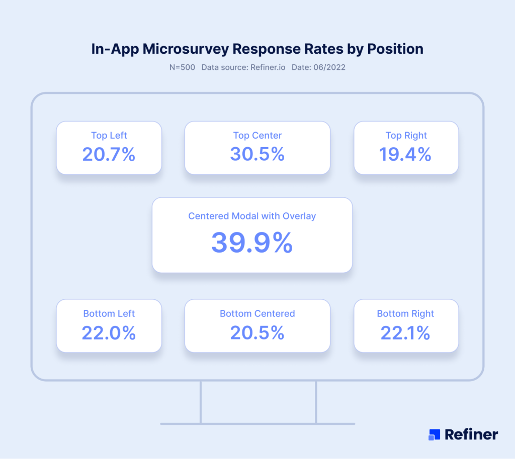
- Placement, meaning where the survey appears. Inline in a success state, a small bottom sheet, or a subtle banner near the primary content usually performs better than a blocking modal in the middle of a task. Central, context relevant placement improves visibility without adding friction.
- Frequency caps, the rules that limit how often users see surveys. If you show a survey every session, the denominator explodes and the rate tanks. Sensible caps, for example at most one exposure every 30 days per survey, plus a snooze window after dismiss, keep fatigue low and rates stable.
- Timing and triggers. Asking right after a meaningful action, for example finishing onboarding or using a new feature twice, outperforms random time based prompts. Fresh context increases the urge to answer.
- Audience targeting. Power users and recently active users answer more often than dormant accounts. Broadcast to everyone lowers the rate and the quality of insights.
- Counting window. A two week launch window can show unusually high or low rates depending on novelty, promotions, or bugs. Longer, apples to apples windows produce steadier numbers.
Why our numbers are higher
- We count submissions ÷ unique survey views, remove test traffic, and report completion too.
- We design for response, short, contextual, native surveys with smart targeting and caps.
- We normalize in fixed windows and compare like with like, so launch spikes do not skew the average.
People ask why our averages sit higher than many roundups. The short answer, we measure the thing that matters and we design for it.
In our dataset, a response is a saved submission divided by unique survey views, not raw impressions or eligible users. We remove test traffic. We report completion alongside response, so you can see if people finish, not just start.
We collect from live in‑app deployments on web and mobile. Most surveys are one or two questions, triggered by meaningful events, placed in success states, and styled to match the product. We use behavioral targeting and strict frequency caps, so the prompt feels relevant and rare, not noisy.
We normalize results in fixed windows, typically 30 days, and annotate launches, outages, or promotions. We do not let a first day spike on a new feature inflate the average. We compare like for like, survey type to survey type.
If you copy this approach, your numbers will rise for the right reasons. If you ask at random, use blocking modals, and blast everyone every session, they will not. Respect timing, context, and effort, and response follows.
How to calculate your rate
When I report response numbers, I first lock the definitions.
- “Submissions” are responses that were actually saved, not partials.
- “Unique survey views” are the distinct users who saw the survey element on screen. If your tool counts every exposure per session, the denominator balloons and your rate looks worse, so switch to unique viewers.
For completion, the denominator is people who started the survey, for example tapped a choice or opened step one. The numerator is those who reached the thank you state and submitted. This splits two different problems:
- Low response rate means few users engage at all, usually a timing or targeting issue.
- Low completion rate means people start then bail, usually a length, wording, or UI issue.
Pick a fixed counting window, say the last 30 days, and keep it consistent. Annotate launches, pricing changes, or outages that may skew results. When you A/B test triggers or designs, use the same definitions so the comparison is clean.
- Response rate = submissions ÷ unique survey views
- Completion rate = completed surveys ÷ started surveys
Next, I’ll show the specific levers that move the number, with exact settings to use in Refiner.
The 14 levers that reliably lift in‑app response rate
First things first: When I say “levers,” I mean the parts of your survey system you can actually pull to change behavior today. So, levers are things like timing, targeting, placement, copy, frequency, and UI choices. Each lever is simple on its own, but together they compound. Below I’ll show what to change, why it works, and where to set it up in Refiner.
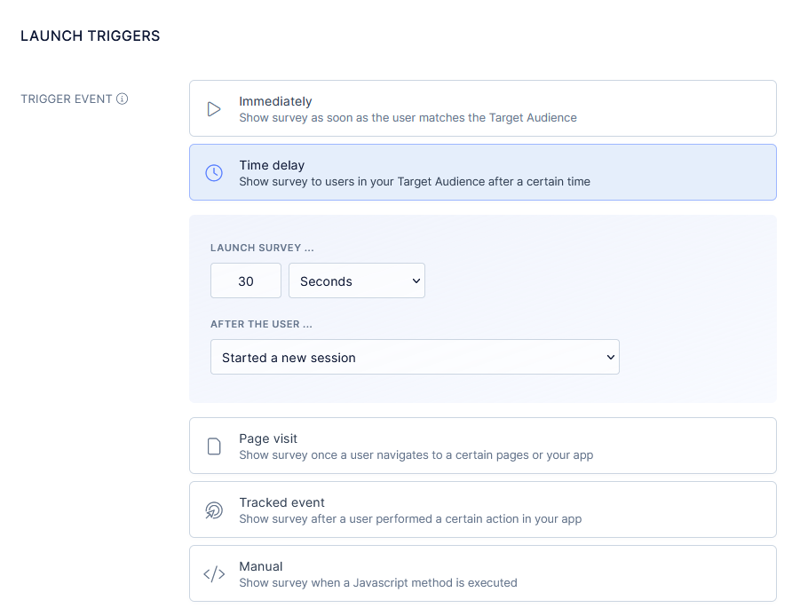
1) Trigger on meaningful actions
When I say meaningful, I mean a real milestone the user just finished, not a random point in the session. Think a user completing the onboarding flow, using a feature for the second time, finishing export, or even creating their first project.
At that moment the context is fresh, the emotion is real, and the answer is specific. You are not asking them to remember, you are asking them to reflect. That shift turns vague opinions into useful signals.
In a nutshell, trigger too early and they have no opinion. Wait too long and the moment fades, response and quality both drop.
- Do: Ask after onboarding completes, after second use of a new feature, after a project is created.
- Why: Fresh context beats memory.
- Refiner: Launch conditions based on events and properties, delay by X seconds after event to avoid mid‑task interrupts.
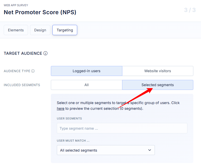
2) Segment by behavior and lifecycle
Segmentation here is not marketing personas, it is live product behavior. I split users by what they did and when they did it, for example new this week, power users of feature X, at risk after 14 days idle, on Agency plan, admin role. Each group is on a different journey and will react to a different question. Broadcast surveys feel irrelevant and get ignored. Behavioral segments let you ask the right question to the right person, at the right time, which is half the battle for response.
- Do: Target active users, new users in week one, or power users of a feature.
- Why: Relevant prompts get answered, blasts get ignored.
- Refiner: Audience rules with events, last seen, plan, role.
3) Add frequency caps and quiet periods
Frequency caps are simple rules that limit how often a user sees surveys. Quiet periods are the cool‑downs after a dismiss or completion. Without both, you create fatigue and your denominator explodes, which drags the rate down. I like one exposure per user per 30 days per survey, and a 7 to 14 day quiet period after a dismiss. These rules protect the experience, keep trust high, and make your numbers honest. You will collect fewer exposures, but you will get more responses per view.
- Do: Cap at one exposure per user per 30 days, add a 7 day quiet period after a dismiss.
- Why: Prevent fatigue, keep the denominator sensible.
- Refiner: Frequency and Throttle settings.
4) Keep it short, one to two questions
Here’s the golden truth of in-app surveys: Short surveys = response rate wins. One tap to answer, maybe one optional follow up. Every extra field adds friction and drop off.
In practice, I lead with a simple scale or yes or no, then open text only when it is needed. Long research surveys belong in email, not inside a task flow. The goal in‑app is fast signal with minimal effort. If you consistently need five questions, you are probably mixing objectives. Split them into smaller moments and you will see the rate climb.
- Do: Lead with a single scale or choice, add one optional follow up.
- Why: Each extra field increases drop off.
- Refiner: Question types scale, choice, optional text, set max questions to two.
5) Match the product’s look and feel
Native design matters. If the survey looks like your app, people trust it and answer. If it looks like a pop up ad, they close it. I reuse app fonts, spacing, tone of voice, and button styles. I also keep layouts compact so users can see the screen behind the survey. The point is to feel like part of the product, not an interruption. That small design choice can be the difference between a tap and a dismiss.
- Do: Use your fonts, spacing, and tone.
- Why: Native design feels safe, pop up styling feels like an ad.
- Refiner: Theme and CSS overrides.
6) Set expectations with microcopy
Microcopy is the small text that answers two silent questions, how long will this take, and why should I help. I tell people the truth, 30 seconds, helps us improve onboarding for you and your team. When they know the cost and the payoff, they say yes more often. Keep it human, keep it short, and avoid corporate speak. Clarity beats clever every time.
- Do: Say how long it takes and why it matters, for example, “30 seconds, helps us improve onboarding.”
- Why: Clarity earns taps.
- Refiner: Title and Description fields.
7) Use one tap inputs first
Start with the lowest effort input you can, a scale, thumbs, emoji, yes or no. That first tap creates momentum and gets you at least one data point from nearly everyone who sees the survey. Then, only when it makes sense, invite a short comment. This order respects time, reduces friction, and still captures depth from people who have something to say.
- Do: Scales, emoji, thumbs, yes or no before open text.
- Why: Low effort starts the momentum.
- Refiner: Button scale or Choice as the first step, then conditional text.
8) Place surveys after success, not mid task
Success states are those small wins users just achieved, project created, export finished, ticket closed. They are natural pauses where attention is free and sentiment is usually higher. Mid task prompts steal focus and feel intrusive. After success, users are more willing to help and have a clear memory of what just happened. That combination lifts both response and usefulness of the feedback.
- Do: Trigger on “project created,” “export complete,” “ticket closed.”
- Why: Users are free to respond and more positive.
- Refiner: Event based Launch conditions with a slight delay.
9) Offer snooze or “ask me later” options
Life happens. People are busy, on a call, or rushing to a meeting. A simple snooze keeps goodwill and saves the response for later. I offer one defer option, then retry next session or after a few days. Forcing a choice now creates friction and trains people to dismiss. Give them an easy out and they will repay you with an answer when they have a minute.
- Do: Let busy users defer once, then retry in a later session.
- Why: Saves the relationship and preserves the rate.
- Refiner: Dismiss actions with re‑ask after N days.
10) Progressive profiling
Instead of asking five things at once, ask one small thing over multiple sessions. Over a month you collect more data with less friction. This works especially well for preference and role questions, or small PMF pulses. To avoid over asking, I set mutual exclusion between surveys and use global caps. The experience feels light, the data adds up, and the rate stays healthy.
- Do: Ask one small thing per session rather than a long form once.
- Why: You collect more, users feel less burden.
- Refiner: Multiple micro surveys with Mutual exclusion and Global frequency caps.
11) Branch only when signal warrants it
Branching is conditional logic that shows a follow up only when the first answer signals an issue or a strong opinion. Detractors in NPS, no on CSAT, confused on a feature poll. Everyone else gets a fast exit. This keeps the average effort low while still giving you depth where you need it. Over branching turns a quick pulse into a mini form and kills completion.
- Do: Add follow up text only for detractors or “no” answers.
- Why: Depth where it counts, speed for everyone else.
- Refiner: Conditional logic on answer values.
12) A/B test timing and copy
You do not need fancy stats to learn here. Test simple, practical changes, prompt at end of flow versus next session, 3 second delay versus 6, help us improve X versus got 30 seconds. Look for clear, directional wins and lock them in. Small wording and timing shifts can move response by double digits. Keep the sample windows similar so your read is clean.
Do: Test immediate versus end of flow, “Help us improve X” versus “Got 30 seconds?” Why: Small wording shifts move big numbers. Refiner: Duplicate survey as Variant A/B, split audiences.
13) Personalize lightly
Personalization works when it proves you are paying attention without feeling creepy. Reference the feature they just used, the plan they are on, or their role. Do not guess at identity or pull in sensitive fields. The tone is, we saw you do X, can we ask about it. That kind of relevance earns trust and taps without crossing the line.
- Do: Reference the feature they just used or their role, for example, “How did the new scheduler work for you, Agency plan?”
- Why: Relevance without creepiness lifts engagement.
- Refiner: Liquid variables or property tags in copy.
14) Close the loop, show the win
If users never see outcomes, they stop answering. Closing the loop can be as simple as a release note, a short in‑app message, or a monthly email that says, you told us onboarding was confusing, here is what we changed. When people see their input turn into improvements, they participate more. It builds trust, lifts future response, and turns surveys into a habit.
Do: Publish “You asked, we shipped” notes, and thank respondents in‑app. Why: Reciprocity. Next time they see a prompt, they answer. Refiner: Send responses to Slack or your changelog tool via Integrations or Webhooks, trigger an in‑app message to announce fixes.
How to Boost In-app Survey Response Rates for NPS, CSAT, Feature Satisfaction, and PMF
For the end, let me show you a couple of playbooks for the most common in-app survey types.
In‑app NPS: lift response without skewing the score
- Goal: fast signal on loyalty without coaching the answer.
- Targeting: users with real usage, for example 7 to 14 active days, exclude first 48 hours and anyone mid trial setup.
- Timing: dashboard or home view, small delay so they are not mid click.
- Copy: “How likely are you to recommend us to a friend or colleague?” Follow with “What is the main reason for your score?” only for low and high scores. Avoid value claims like “we work hard,” they bias answers.
- UI: compact widget that keeps the page visible.
- Frequency: once per 90 days per user.
- Metrics: response rate by segment, share of detractors, completion rate on the follow up.
- Pitfalls: asking too early, asking right after a negative event, or repeating within a month.
CSAT after support or task completion: catch the moment
- Goal: measure satisfaction with a specific interaction while memory is fresh.
- Targeting: people whose ticket moved to solved or who just completed a defined flow, for example export, publish, send.
- Timing: on the confirmation screen. If the user closed fast, show it next session.
- Copy: “Did we solve your problem today?” yes or no. If no, add “What was missing?” Keep it optional.
- UI: inline block or bottom sheet so they can answer in one tap.
- Frequency: cap at one per user per 14 days to avoid over sampling heavy users.
- Metrics: response rate, yes rate, percent with a comment, tags from the no answers.
- Pitfalls: burying the prompt in email only, or asking while the case is still open.
Feature satisfaction: validate the thing you just shipped
- Goal: learn if a new or redesigned feature is clear and useful.
- Targeting: users who used the feature twice. The second use filters out drive‑by clicks.
- Timing: immediately after the second interaction or at exit from that view.
- Copy: “Was this feature useful today?” yes or no. If no, “What made it hard?” If yes, “What did you do with it?”
- UI: small prompt anchored near the feature area. Avoid full‑screen modals.
- Frequency: one response per user per feature per release.
- Metrics: response rate by role or plan, yes rate over the first two weeks post launch, top reasons for no.
- Pitfalls: asking on first use, running the survey for months after the feature has matured, or mixing multiple features in one prompt.
PMF pulse in‑product: light, rare, and only to engaged users
- Goal: track product market fit sentiment without spamming casual users.
- Targeting: consistently active users, for example 3 sessions per week for two weeks, exclude new users and those at risk from recent issues.
- Timing: stable moments like dashboard load at the start of a session.
- Copy: “How disappointed would you be if you could no longer use this product?” Very, somewhat, not at all. Optional “What is the main reason?”
- UI: compact, first choice buttons visible without scrolling.
- Frequency: once per quarter per user, not more.
- Metrics: share of “very disappointed,” response rate, reasons grouped by theme.
- Pitfalls: sending to everyone, asking during outages, or combining with other surveys in the same week.
Onboarding experience: find friction without derailing setup
- Goal: surface the step that made people stall or second guess.
- Targeting: users who completed onboarding within the last 24 hours. Skip those who failed to complete, they need a different flow.
- Timing: right after the last onboarding step or on first visit to the core screen.
- Copy: “Was anything confusing in the setup?” Then, “What did you expect to happen that did not?” Keep both short.
- UI: inline on the final step or a small card on the first dashboard.
- Frequency: one time only.
- Metrics: response rate, top friction themes, time to complete before and after fixes.
- Pitfalls: asking mid flow, mixing welcome content with the survey, or sending a long checklist.
And that’s it…
This is everything you need to know about increasing in-app survey response rates.
Good luck!
Increasing In-app Survey’s Response Rate – FAQ
Most teams see 25%–30%. With tight timing, targeting, and native UI, I regularly see ~27% response and ~25% completion. If you’re under 10% for weeks, fix timing first.
Start with three moves: 1) trigger after meaningful actions, 2) cut to one or two questions, 3) add a quiet period so people don’t see the same prompt twice in a week. You’ll feel the bump fast.
For in-app pulses, usually no. Small perks can bias answers and aren’t needed when the moment is fresh. If you’re running long research surveys, a modest incentive is fine. Closing the loop publicly is a better long‑term motivator.
Cap at one exposure per user per 30 days per survey, and add a 7–14 day quiet period after a dismiss. Heavy users shouldn’t see prompts every session.
Random timing mid‑task, long forms, off‑brand modals, blasting everyone, and asking again right after someone declined.
In-app wins for speed and context. Email is fine for longer follow‑ups or churned users. If you want step‑by‑step setups, see the in‑app NPS guide and the in‑app CSAT guide.
Response = submissions ÷ unique survey views. Completion = completed ÷ started. Use one counting window (e.g., 30 days) for comparisons.
Short CSAT, micro polls, and NPS with one follow‑up tend to outperform long research flows. Context and effort matter more than the label.
Recommended reading
Here are several other guides I wrote on in-app surveys to help you get the most out of them.
- In‑app surveys: the complete guide
- In‑app survey response rates (our own study)
- In‑app NPS: setup, examples, best practices
- In‑app CSAT: setup and best practices
- Customer Effort Score: what it is
- 12 CES questions to use right away
- Product survey questions (with examples)
- 7 in‑app survey examples to follow