Chart Options
Each chart on a dashboard has a set of settings. Depending on the chart type, the following options are available.
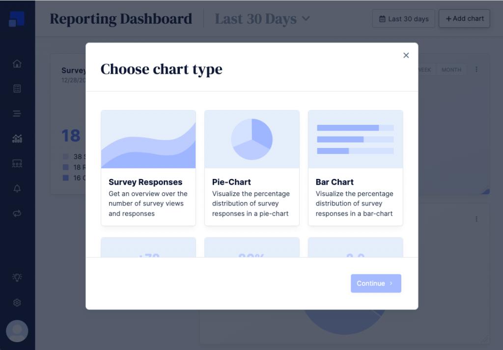
Chart type
The chart type option can be set when creating a new chart and can’t be changed once a chart was added to a dashboard. A full list of available chart types can be found here.
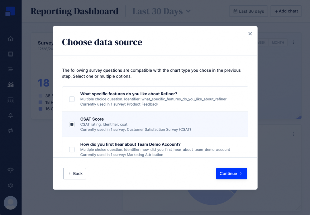
Data source
Depending on the chart type you’ve selected in the previous step, you’ll be presented with survey questions that match your data type. You can select one or multiple surveys questions to include in your chart. To better identify questions across different surveys, some additional information is shown below the question headlines.
This step is skipped for “Survey Responses” and “Tags” charts.
Overwrite filters
Reporting dashboards feature a global filter sidebar that controls which data is displayed across all charts. If needed, you can override these global filters and set custom filters for individual charts.
You can filter survey response data by
- User segment: If activated, only survey responses where the user matches one of the selected segments are included in your chart.
- Surveys: If activated, only responses given to certain surveys are included in the chart.
- Tags: If activated, only responses with a specific tag are included in the chart.
When activated, you’ll see an orange icon in the top right corner of the survey, indicating that specific data filters are active.
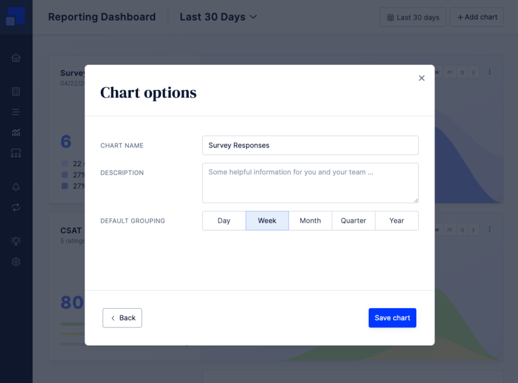
Description
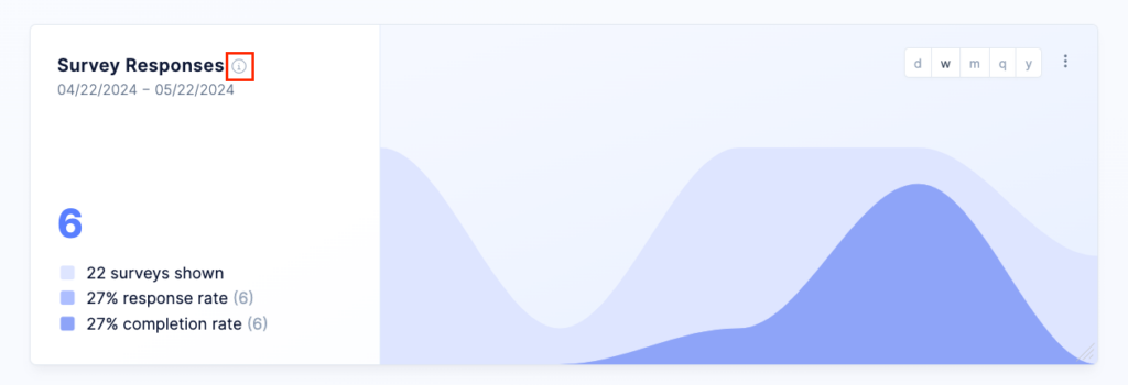
Next to choosing a descriptive name for your chart, you can also add a short description of the data shown in the chart.
When you add a description for a chart, you’ll see a tooltip icon next to the chart name. Clicking on the tooltip icon will reveal the chart description.
Other options
Timeline charts, such as the Response Overview, NPS, CSAT or Rating Chart, come with an additional option to set the default time grouping. You can choose between Day, Week, Month, Quarter and Year.
The Bar-Chart, Distribution Trend and Tag Overview have an option to set the default order of the data “Alphabetical” or by “Count”.