Pie Chart
Introduction
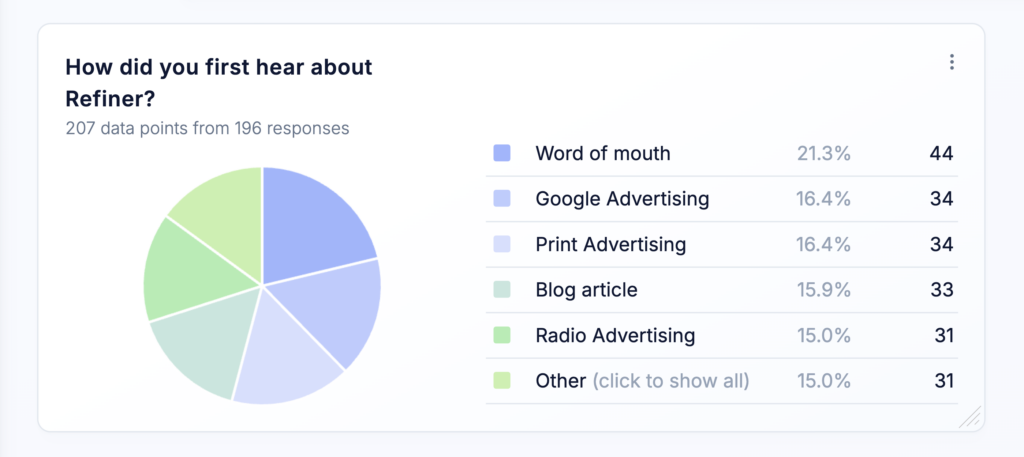
Pie Charts display the distribution of survey response data as proportional slices, making them ideal for getting a quick visual overview of multiple-choice and other categorical data.
Pie Charts can be freely positioned and resized on your dashboard, allowing you to create a layout that works best for your reporting needs.
Choose data source
Like other dashboard charts, a Pie Chart is not limited to a single survey or question.
In the chart settings, you can select one or more questions from one or more surveys. Responses from all selected questions are combined when calculating the percentage distribution displayed in the chart.
The chart supports response data from virtually all question types, except Open Text questions.
This allows you to create charts that:
- Show the overall response distribution across several surveys
- Focus on a specific survey or customer touchpoint
- Combine equivalent questions used in different campaigns
- Compare surveys or audiences using multiple charts
For the clearest results, combine questions that use comparable answer options or rating scales.
Chart options
You can configure the following options in the chart edit modal:
Name
Enter a name for the chart. The name appears as the chart headline and should help users understand at a glance what the chart displays.
Use a specific, descriptive name, especially when your dashboard contains multiple charts with different data sources, audiences, or filters.
Description
Add an optional description to provide additional context about the chart. The description appears as a tooltip when users hover over the information icon next to the chart name.
You can use it to communicate important information to your team, such as:
- Where the data comes from
- Which audience or filters are applied
- The purpose of the chart
- How the results should be interpreted
Default order
Choose how results are ordered:
- Alphabetical: Sorts results alphabetically by answer text.
- By count: Sorts results by the number of times each answer was selected.
Percentage base
For multiple-choice questions, a single survey response can contain several selected options. As a result, the number of selected options, or data points, may be greater than the number of responses.
Choose how percentages are calculated:
- Responses: Calculates each percentage based on the total number of survey responses.
- Data points: Calculates each percentage based on the total number of selected options.
Top results only
Limit the chart to the top 5, 10, 15, or 20 results. Any remaining results are grouped under Other, helping keep Pie Charts with many possible answers easier to read.
These settings define the chart’s default appearance. You can also change them directly within the chart for ad-hoc analysis without modifying its default configuration.
Overwrite filters
By default, the chart uses the filters applied to the dashboard.
You can overwrite these filters for an individual chart to analyze a more specific subset of responses. This allows you to apply different filters to multiple Distribution Trend Charts on the same dashboard and compare audiences, surveys, time periods, or response segments side by side.