Ratings Chart
Introduction
Rating charts provide a clear overview of the average rating and the distribution of responses across a numeric scale.
You can add rating charts to both ad-hoc survey dashboards and custom dashboards. Each chart can combine responses from multiple rating questions and surveys, giving you control over exactly which data is included in the calculation.
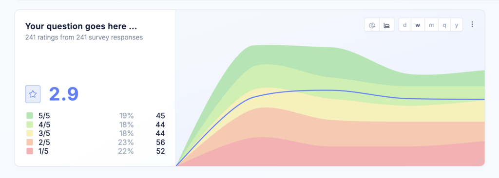
Depending on the scale configured for the selected questions, ratings can range from 1 to 10.
Rating questions can display numbers or icons such as stars, hearts, or thumbs. Regardless of how the question is displayed, responses are stored and analyzed as numeric values.
This chart type supports responses from Star & Number Rating and NPS questions. However, we recommend using the dedicated NPS chart when analyzing NPS results.
Chart layout
A rating chart is divided into two sections.
Rating summary
The left side of the chart provides a summary for the selected data and time period. It displays:
- The number of data points and responses included
- The overall average rating
- The number and percentage of responses for each rating value
The available rating values are determined by the scale used by the questions linked to the chart. For example, a five-point rating chart displays the distribution from 1 to 5.
The legend uses consistent color coding for each rating value throughout the chart.
The right side of the chart can display either a timeline trend or a distribution pie chart.
Timeline trend
The timeline view shows how the response distribution and average rating changed over time.
The chart contains colored areas representing the proportion of responses for each rating value. A separate line shows the average rating over the same period.
You can group timeline data by:
- Day
- Week
- Quarter
- Year
Choose a grouping that matches the amount of data available and the period you want to analyze. Shorter intervals provide more detail, while longer intervals make broader trends easier to identify.
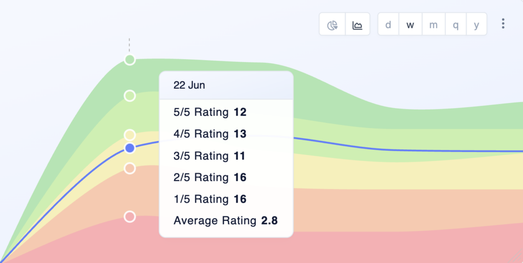
Hover over any point in the timeline to display a tooltip with the exact values for that time period. The tooltip provides a detailed breakdown of the counts represented in the chart.
Distribution pie chart
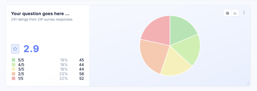
You can replace the timeline trend with a pie chart showing the overall distribution of rating values.
The pie chart represents the same totals and percentages shown in the legend on the left. It is useful when you want to focus on the overall distribution rather than changes over time.
Choose rating data source
Like other dashboard charts, a rating chart is not limited to a single survey or question.
In the chart settings, you can select one or more rating questions from one or more surveys. Responses from all selected questions are combined when calculating the average rating and response distribution.
This allows you to create charts that:
- Show an overall rating across several surveys
- Focus on a specific survey or customer touchpoint
- Combine equivalent rating questions used in different campaigns
- Compare different surveys or audiences using multiple charts
The questions linked to a chart must use a compatible rating scale. For example, questions using a 1-to-5 scale should be analyzed separately from questions using a 1-to-10 scale.
Chart options
Name
Enter a name for the chart. The name appears as the chart headline and should help users understand at a glance what the chart displays.
Use a specific, descriptive name, especially when your dashboard contains multiple charts with different data sources, audiences, or filters.
Description
Add an optional description to provide additional context about the chart. The description appears as a tooltip when users hover over the information icon next to the chart name.
You can use it to communicate important information to your team, such as:
- Where the data comes from
- Which audience or filters are applied
- The purpose of the chart
- How the results should be interpreted
Timeline grouping
Choose the time interval used to group responses:
- Day
- Week
- Month
- Quarter
- Year
A shorter interval provides more detail, while a longer interval creates a smoother view of long-term trends.
Overwrite filters
By default, the chart uses the filters applied to the dashboard.
You can overwrite these filters for an individual chart to analyze a more specific subset of responses. This allows you to apply different filters to multiple Distribution Trend Charts on the same dashboard and compare audiences, surveys, time periods, or response segments side by side.
Adjust size and positioning
Like all other charts, Rating charts can be freely positioned and resized on custom dashboards.
When there is enough horizontal space, the chart displays both the rating summary and the selected trend or distribution view. At narrower widths, the chart may display only the summary section.
Best practices
- Monitor changes over time – An average rating provides a useful snapshot, but the timeline view offers more context. Use it to identify whether ratings are improving or declining following product releases, service changes, or other initiatives.
- Choose an appropriate time grouping – Use daily or weekly grouping when you receive a high volume of responses. For smaller datasets or longer reporting periods, quarterly or yearly grouping can produce a clearer and more representative trend.
- Review the full distribution – The average rating does not always reveal how responses are distributed. Two datasets can have the same average while containing very different proportions of high and low ratings. Use the legend, timeline areas, or pie chart to understand the distribution behind the average.
- Monitor response volume – A noticeable change based on only a few responses may not represent a meaningful shift. Review the response count alongside the average rating when interpreting changes.
- Segment your audience – Use dashboard filters or chart-level filter overrides to compare ratings across customer groups.
- Pair ratings with qualitative feedback – Combine rating charts with open-ended follow-up questions, response tags, and qualitative feedback to understand why respondents selected a particular rating.
- Use dedicated charts for NPS and CSAT – Rating questions are suitable for general-purpose numeric ratings. For established metrics such as Net Promoter Score or Customer Satisfaction Score, use the dedicated NPS or CSAT question types and charts. These apply the appropriate scoring methods and response categories automatically.