Tags Overview
Introduction
The Tags Overview Chart shows how frequently response tags appear across matching survey responses.
It provides a quick way to identify the most common topics, categories, or themes in your response data. Depending on your preferred layout, tag usage can be displayed as either a bar chart or a tag cloud.
Visualization options
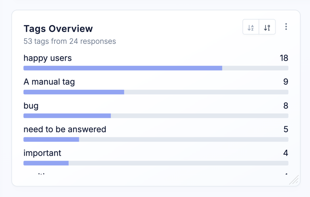
Bar chart
The bar chart displays tags as a ranked list. The length of each bar represents how many matching survey responses contain that tag.
This layout makes it easy to compare tag counts and identify the most frequently used tags.
Tag cloud
The tag cloud provides a more visual overview of tag usage. Frequently used tags appear more prominently than tags with fewer occurrences.
Clicking a tag in the cloud opens the Responses List with a filter applied for that tag. This allows you to quickly review the survey responses behind a particular topic or category.
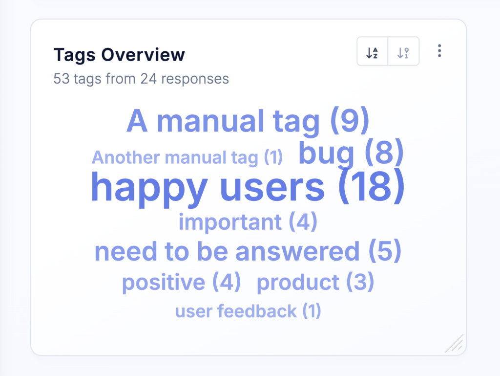
Chart options
Name
Enter a name for the chart. The name appears as the chart headline and should help users understand at a glance what the chart displays.
Use a specific name when your dashboard contains multiple Tags Overview Charts, such as Most common feature requests or Reasons for cancellation.
Description
Add an optional description to provide additional context. The description appears as a tooltip when users hover over the information icon next to the chart name.
You can use it to explain:
- Which surveys or responses are included
- How the tags are assigned
- Which filters are applied
- The purpose of the chart
- How your team should interpret the results
Default order
Choose how tags are ordered:
- Alphabetical – Tags are sorted alphabetically by name.
- Count – Tags are sorted by how frequently they occur.
Sorting by count is usually the best option when you want to identify the most common tags. Alphabetical ordering can make it easier to locate a particular tag.
Top results only
Enable Top results only to limit the chart to the most frequently occurring tags.
This is useful when your project contains many tags and displaying all of them would make the chart difficult to read. Less frequently used tags are excluded from the visualization.
Visualize as
Choose how tag usage is displayed (see above):
- Tag cloud – Displays tags in a visual cloud, with more frequently used tags appearing more prominently.
- Bar chart – Displays tags as bars, making their occurrence counts easier to compare.
Use the tag cloud for a quick visual summary. Use the bar chart when precise comparisons and rankings are more important.
Choose which tags should appear when a tag filter is applied through the dashboard sidebar or the chart’s overwrite filters:
- Only selected tags – Displays only the tags explicitly selected in the active tag filter.
- All response tags – Displays every tag attached to the survey responses that match the active filters.
This option changes which tags are visualized, not which responses are included.
For example, suppose you filter the dashboard by the tag Feature request. The chart first finds all responses containing that tag:
- With Only selected tags, the chart displays only Feature request.
- With All response tags, the chart also displays any other tags attached to those responses, such as Reporting, Integrations, or Mobile app.
The All response tags option is useful for discovering which topics frequently appear together.
Overwrite filters
By default, the chart uses the filters applied through the dashboard sidebar.
You can overwrite these filters for an individual chart to analyze a specific subset of responses. For example, you can limit the chart to particular surveys, audiences, response tags, or time periods.
This allows you to add multiple Tags Overview Charts to the same dashboard and compare tag usage across different surveys or user segments.
Adjust size and position
The Tags Overview Chart can be freely resized and repositioned on your dashboard.
A larger chart provides more room for displaying tags, particularly when using the tag cloud or visualizing a large number of results.
Best practices
- Use the Bar chart visualization when you need to compare exact tag frequencies or clearly rank the most common topics.
- Use the Tag cloud for a compact visual overview and when you want team members to quickly explore the responses associated with individual tags.
- Enable Top results only when your project contains many tags. Limiting the number of displayed results makes the most important patterns easier to identify.
- Use All response tags together with a tag filter to explore relationships between topics. This can reveal which tags frequently occur on the same responses.
- When comparing different surveys or audiences, create separate charts and use consistent ordering and visualization settings. This makes differences in tag usage easier to interpret.