Responses Overview
Introduction
The Responses Overview Chart gives you a quick snapshot of your surveys’ reach, engagement, and performance.
It combines headline metrics with a timeline showing how survey views and responses change over time. This makes it easy to monitor overall activity, identify spikes or declines, and compare the performance of different surveys or audiences.
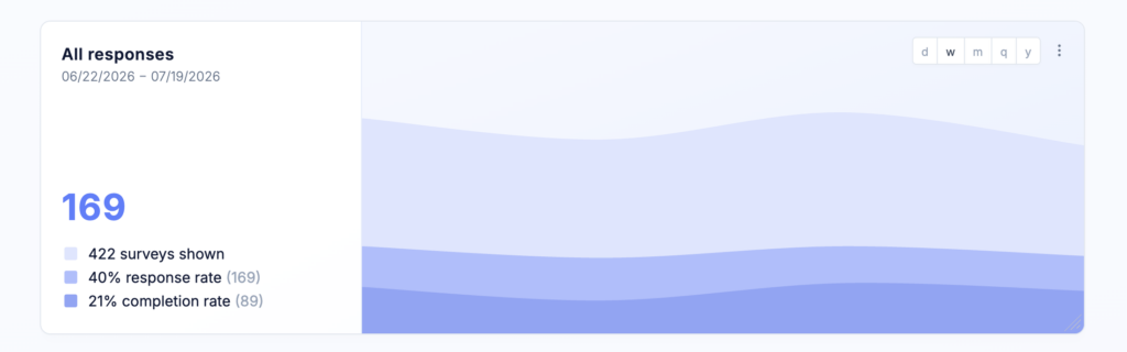
Chart layout
The chart is divided into two sections.
Performance overview
The left side displays the selected date range and the following key metrics:
- Responses – The total number of responses collected.
- Views – The total number of times the selected surveys were displayed.
- Response rate – The percentage of survey views that resulted in a response.
- Completion rate – The percentage of respondents who completed the survey after starting it.
Together, these metrics help you understand both how frequently your surveys are seen and how users engage with them.
Timeline chart
The right side displays a timeline showing the number of survey views and responses collected during each period.
Comparing the two values helps you understand whether changes in response volume are caused by changes in survey exposure or changes in user engagement. It also makes it easy to identify spikes, declines, and longer-term trends.
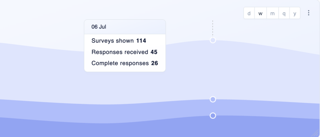
Hover over any point in the timeline to display a tooltip with the exact values for that time period. The tooltip provides a detailed breakdown of the counts represented in the chart.
Choose data source
Select the survey or surveys whose performance you want to display.
When multiple surveys are selected, their views, responses, and performance metrics are combined in the chart. This can be useful for monitoring a group of related surveys or getting an overview of all survey activity within a specific initiative.
Chart options
Name
Enter a name for the chart. The name appears as the chart headline and should help users understand at a glance what the chart displays.
Use a specific name when your dashboard contains multiple Responses Overview Charts, such as Onboarding survey performance or Enterprise customer surveys.
Description
Add an optional description to provide additional context. The description appears as a tooltip when users hover over the information icon next to the chart name.
You can use it to explain:
- Which surveys are included
- Which audience or filters are applied
- The purpose of the chart
- How your team should interpret the metrics
Timeline grouping
Choose the time interval used to group views and responses:
- Day
- Week
- Month
- Quarter
- Year
Shorter intervals provide more detail, while longer intervals make broader trends easier to identify.
Overwrite filters
By default, the chart uses the filters applied to the dashboard.
You can overwrite these filters for an individual chart to analyze a specific subset of data. For example, you can limit the chart to a particular user segment, survey, response tag, or date range.
This also allows you to add multiple Responses Overview Charts to the same dashboard and compare the performance of different surveys or audiences side by side.
Adjust size and position
The Responses Overview Chart can be freely resized and repositioned on your dashboard.
Increasing its width gives the timeline more space and makes individual periods easier to inspect. A more compact layout works well when the headline metrics are the primary focus.
Best practices
- Use a timeline grouping that matches your response volume. Daily grouping is useful for high-volume surveys or short campaigns, while weekly or monthly grouping usually provides a clearer view for surveys with fewer responses.
- Review views and responses together. An increase in responses may simply be caused by the survey being displayed more frequently, while a higher response rate indicates stronger engagement.
- Use the completion rate to identify surveys that users frequently start but do not finish. A low completion rate may indicate that the survey is too long, contains unclear questions, or appears at the wrong moment.
- When comparing surveys or audiences, use separate charts with consistent timeline groupings and date ranges. This makes differences in reach and engagement easier to interpret.