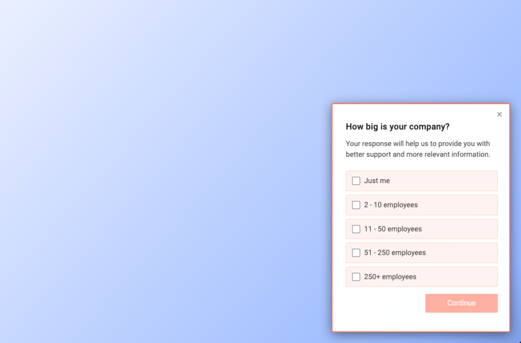
Layout
Refiner offers the same type of survey experience across all delivery methods. Depending on the delivery method (e.g. web app survey) and the client device (desktop or mobile), slightly different survey layout options are available as described below.
In-App Placement
Web App Surveys
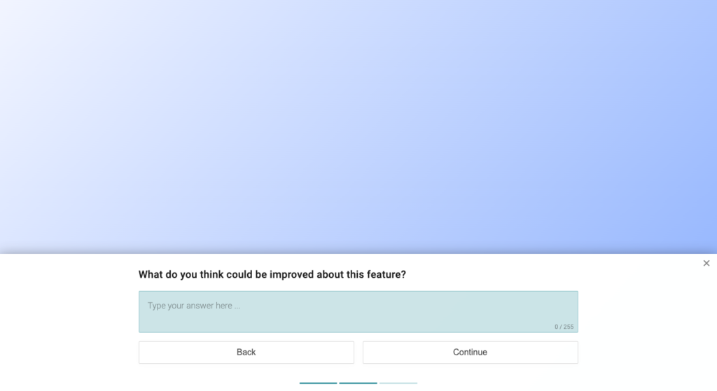
Web App Surveys can have different layout options when viewed on a desktop or tablet device. Which layout you choose for your survey has not just an impact on the user experience, but might also impact survey response rates. As a rule of thumb: the more intrusive and visible a survey is (e.g. centered layout), the higher the response rates.
The following options are available for Web App Surveys on Desktop clients:
- Top left, Top centered, Top right
- Bottom left, Bottom Centered, Bottom right
- Modal
- Top Banner, Bottom Banner
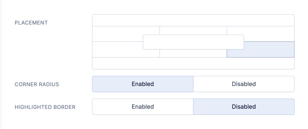
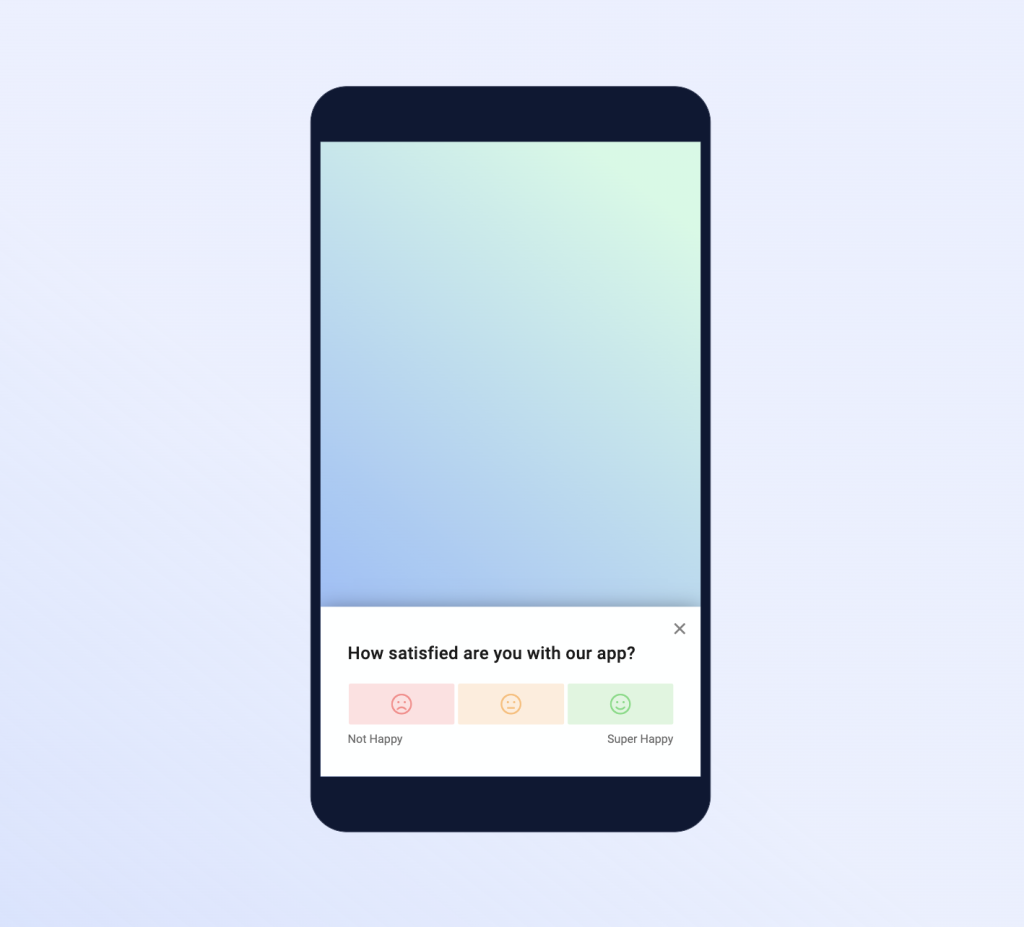
On mobile devices, popup surveys are displayed with a bottom slide-in on mobile devices.
Below you’ll see a screenshot of some popular options.
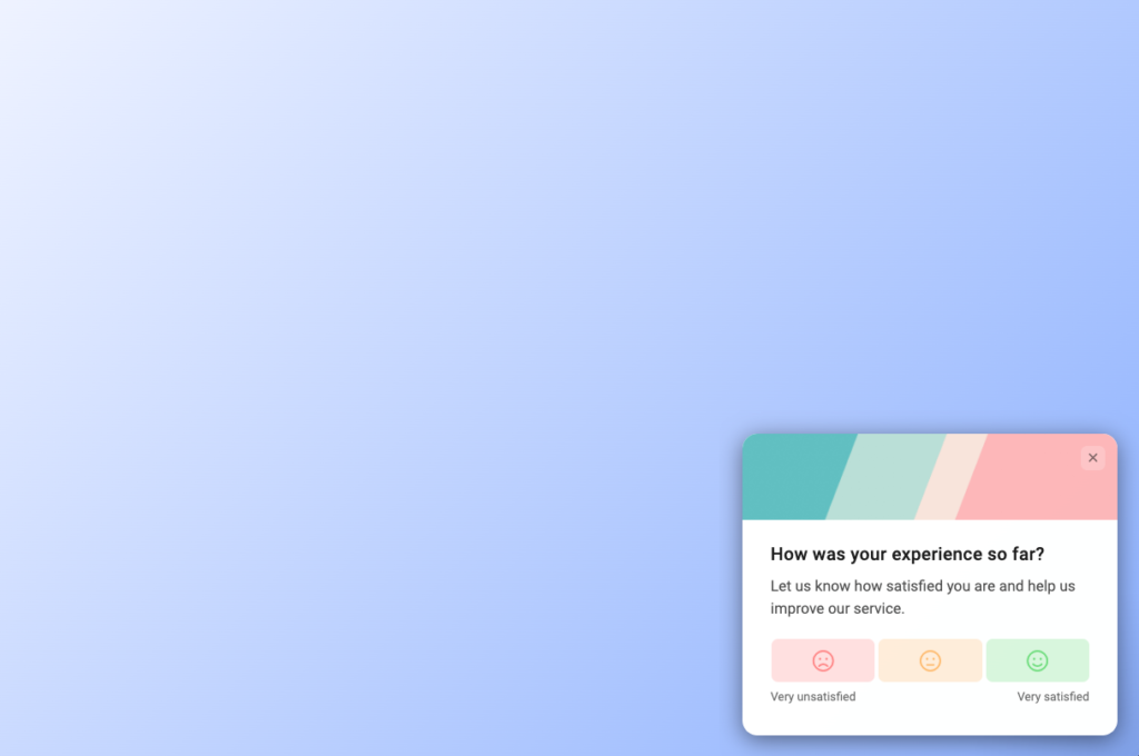
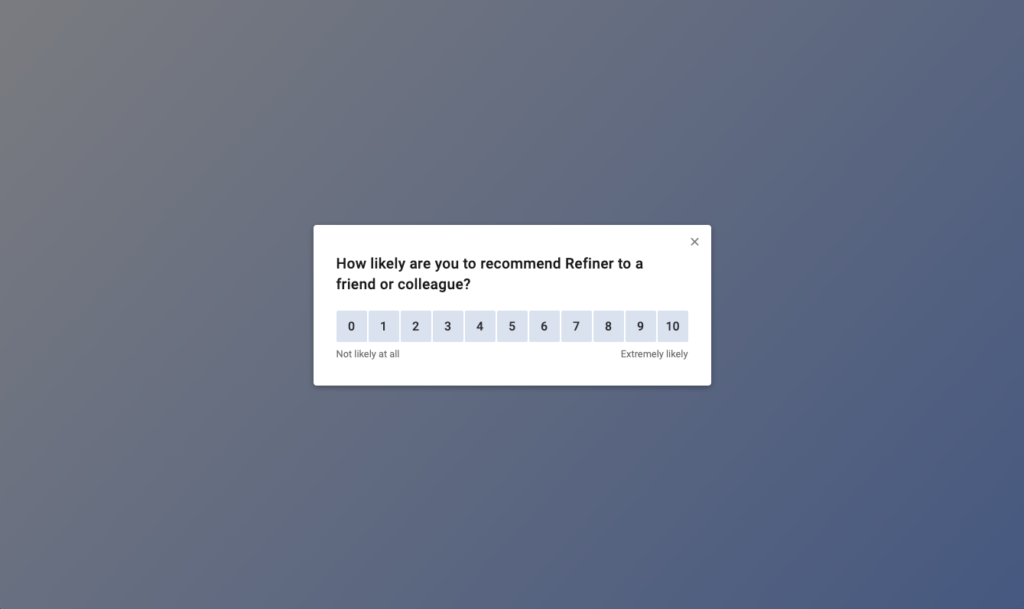
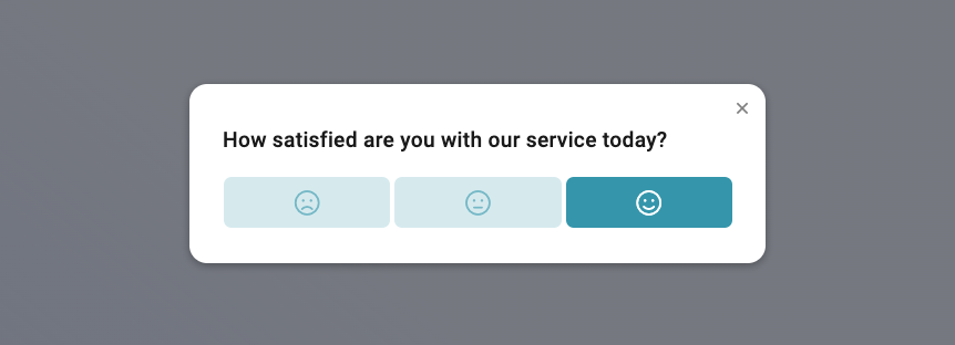
Another popular choice are centered surveys with a backdrop overlay.
Lastly, you can also use our banner layout to make use of the entire screen.
When viewed on a mobile device, Web-app Surveys are always displayed bottom centered to ensure a good user experience.
Mobile App Surveys
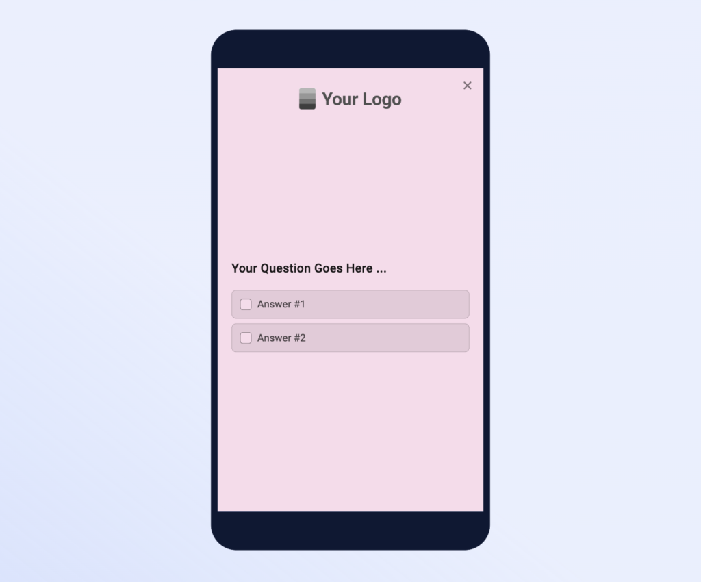
Native mobile app surveys launched with our Mobile SDKs can be displayed as Bottom Slide-in or in Fullscreen mode.
Corner Radius
To better match the style of your application, you can choose between rounded or straight corner style.
Highlighted border