Tags Trend Chart
Introduction
The Tags Trend Chart shows how frequently response tags are added to matching survey responses over time.
Instead of only showing the total usage of each tag, the chart visualizes how tag frequency changes across different periods. This makes it useful for identifying emerging topics, recurring themes, and changes in customer feedback.
For example, you can use the chart to see whether reports of a particular issue are increasing, whether a feature request is becoming more common, or how feedback themes change after a product release.
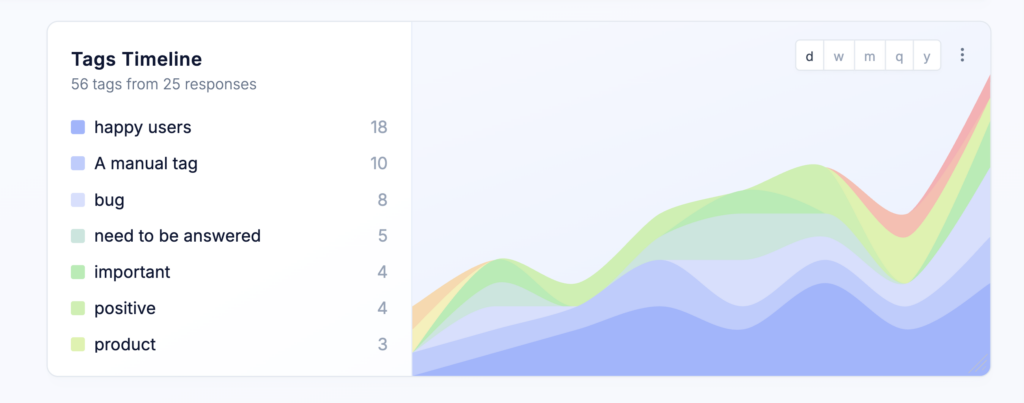
Chart layout
The Tags Trend Chart is divided into two sections.
Tag legend
The left side displays a color-coded legend containing the tags included in the chart.
For each tag, the legend shows its total number of occurrences within the selected date range. The colors used in the legend correspond to the colored areas in the timeline.
Timeline chart
The right side displays an area timeline showing how often each tag was added during every time period.
Each colored area represents a tag. Changes in the size of an area show whether that tag became more or less frequent over time.
Hover over any point in the timeline to display a tooltip with the exact values for that time period. The tooltip provides a detailed breakdown of the counts represented in the chart.
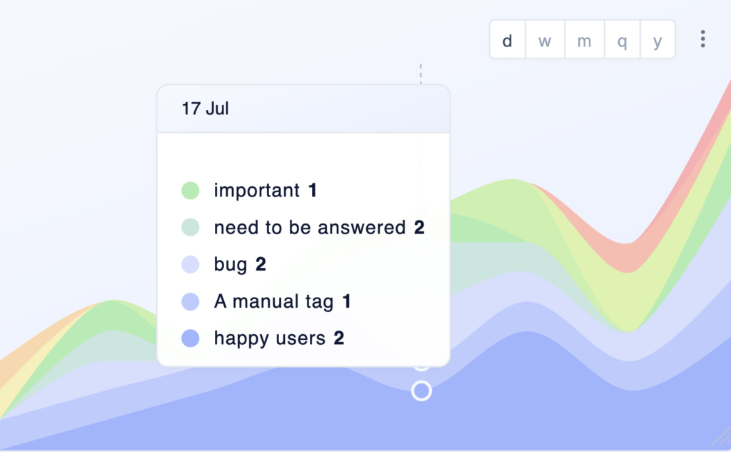
Chart options
Name
Enter a name for the chart. The name appears as the chart headline and should help users understand at a glance what the chart displays.
Use a specific name when your dashboard contains multiple Tags Trend Charts, such as Feature requests over time, Reported issues, or Cancellation reasons.
Description
Add an optional description to provide additional context. The description appears as a tooltip when users hover over the information icon next to the chart name.
You can use it to explain:
- Which surveys or responses are included
- How the tags are assigned
- Which filters are applied
- The purpose of the chart
- How your team should interpret the trends
Top results only
Enable Top results only to limit the chart to the most frequently occurring tags.
This is useful when your project contains many tags and displaying all of them would make the timeline difficult to read. Less frequently used tags are excluded from both the legend and the timeline.
Timeline grouping
Choose the time interval used to group tag occurrences:
- Day
- Week
- Month
- Quarter
- Year
Shorter intervals provide more detail and are useful for high-volume datasets or short campaigns. Longer intervals create a smoother view and make long-term trends easier to identify.
Choose which tags should appear when a tag filter is applied through the dashboard sidebar or the chart’s overwrite filters:
- Only selected tags – Displays only the tags explicitly selected in the active tag filter.
- All response tags – Displays every tag attached to the survey responses that match the active filters.
This setting changes which tags are visualized, not which survey responses are included.
For example, suppose you filter the dashboard by the tag Feature request. The chart first finds all responses containing that tag:
- With Only selected tags, the timeline displays only occurrences of Feature request.
- With All response tags, the timeline also displays other tags attached to those responses, such as Reporting, Integrations, or Mobile app.
The All response tags option is useful for understanding which topics frequently occur together and how those relationships change over time.
Overwrite filters
By default, the chart uses the filters applied through the dashboard sidebar.
You can overwrite these filters for an individual chart to analyze a specific subset of responses. For example, you can limit the chart to particular surveys, audiences, response tags, or date ranges.
This allows you to add multiple Tags Trend Charts to the same dashboard and compare how feedback themes develop across different surveys or user segments.
Adjust size and position
The Tags Trend Chart can be freely resized and repositioned on your dashboard.
Increasing the chart width gives the timeline more horizontal space and makes changes between individual periods easier to inspect. Increasing its height makes charts containing many tags easier to read.
Best practices
- Choose a timeline grouping that matches your response volume. Daily or weekly grouping works well for high-volume datasets, while monthly or quarterly grouping is usually clearer for smaller datasets.
- Enable Top results only when many tags are present. Limiting the visualization to the most common tags makes meaningful trends easier to identify.
- Use Only selected tags when you want to track the development of specific topics. Use All response tags when you want to discover related themes among responses matching a particular tag.
- Consider whether a change in tag count reflects a genuine shift in customer feedback or simply a change in the total number of responses collected. Comparing the Tags Trend Chart with a Responses Overview Chart can provide additional context.
- When comparing surveys or audiences, create separate charts with consistent timeline groupings and date ranges. This makes differences in tag frequency easier to interpret.