Survey Design
Introduction
Getting your survey design right is not just a matter of respecting your brand guidelines or providing a pleasant experience to your users. A well designed survey also yields higher completion rates and thus better customer insights. Refiner offers various styling options to make your survey blend perfectly with your brand and guarantee highest response rates.
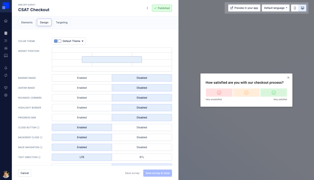
Survey layouts
Refiner offers the same type of survey experience across all delivery methods. Depending on the delivery method and the client device (desktop or mobile), slightly different survey layout options are available as described below.
Web App Surveys
Web App Surveys can have different layout options when viewed on a desktop or tablet device. Which layout you choose for your survey has not just an impact on the user experience, but might also impact survey response rates. As a rule of thumb: the more intrusive and visible a survey is (e.g. centered layout), the higher the response rates.
The following options are available for Web App Surveys on Desktop clients:
- Top left, Top centered, Top right
- Bottom left, Bottom Centered, Bottom right
- Modal
- Top Banner, Bottom Banner
On mobile devices, popup surveys are displayed with a bottom slide-in on mobile devices.
Below you’ll see a screenshot of some popular options.
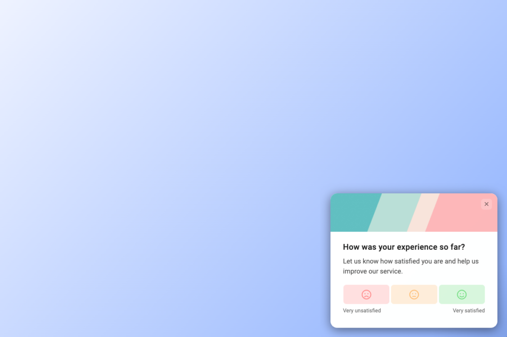
Another popular choice are centered surveys with a backdrop overlay.
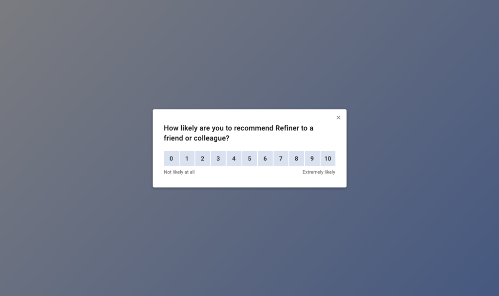
Lastly, you can also use our banner layout to make use of the entire screen.
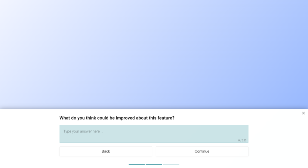
When viewed on a mobile device, Web-app Surveys are always displayed bottom centered to ensure a good user experience.
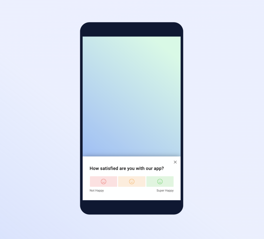
Mobile App Surveys
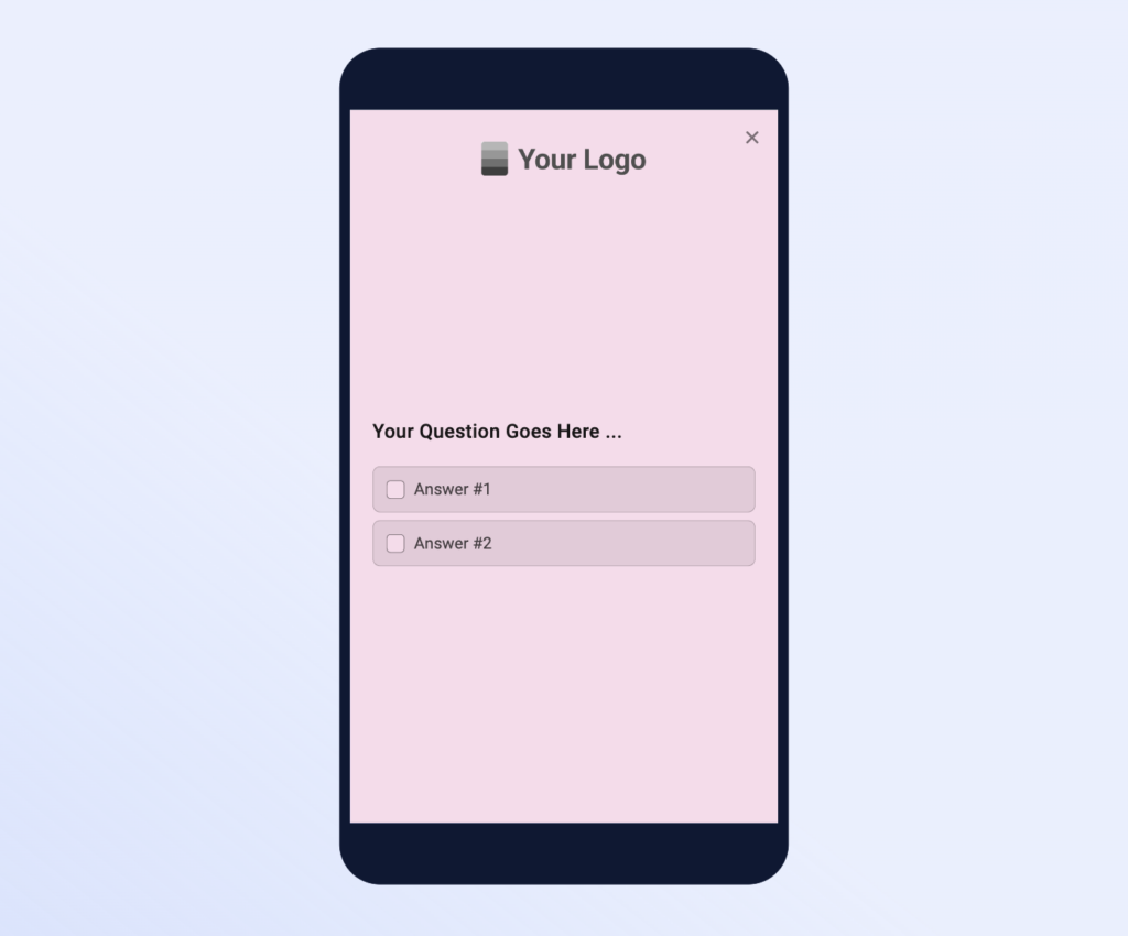
Native mobile app surveys launched with our Mobile SDKs can be displayed as Bottom Slide-in or in Fullscreen mode.

Survey Pages
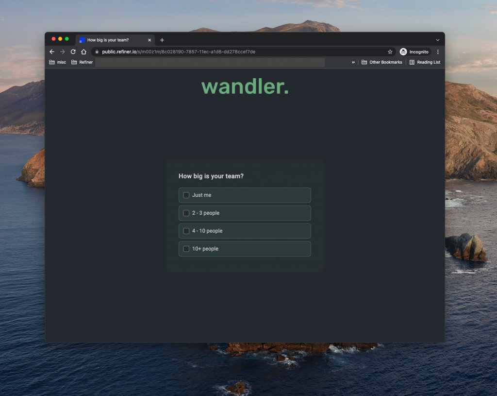
Survey Pages, as well as the landing pages of Email Surveys, offer a layout similar to our survey widgets. Most of the design options are available (colors, rounded corners, progress bar). In addition, you can also upload your own logo.
Styling options
Refiner offers the same type of survey experience across all delivery methods. We provide similar design options for Web App Surveys, Mobile App Surveys, Survey Pages and Email Surveys as shown in the table below. Each option is described more in detail further below on this page.
| In-Product Web | In-Product Mobile SDK | Survey Pages | |
| Adaptive color palettes | ✓ | ✓ | ✓ |
| Rounded corners | ✓ | ✓ | ✓ |
| Progress bar | ✓ | ✓ | ✓ |
| Highlighted border | ✓ | – | – |
| Banner images | ✓ | ✓ | – |
| Avatar images | ✓ | Bottom Sheet | – |
| Font style | ✓ | ✓ | ✓ |
| Upload logo | – | ✓ | ✓ |
| Hide close button | ✓ | ✓ | – |
| Backdrop overlay | ✓ | ✓ | – |
| Back navigation | ✓ | ✓ | ✓ |
| Text direction | ✓ | ✓ | ✓ |
| Hide Refiner Branding | ✓ | ✓ | ✓ |
Adaptive color palettes
Refiner allows you to choose an Accent Color and Background Color for your surveys. Both, the Accent and Background Colors, are used in different shades in your surveys for input fields and buttons.
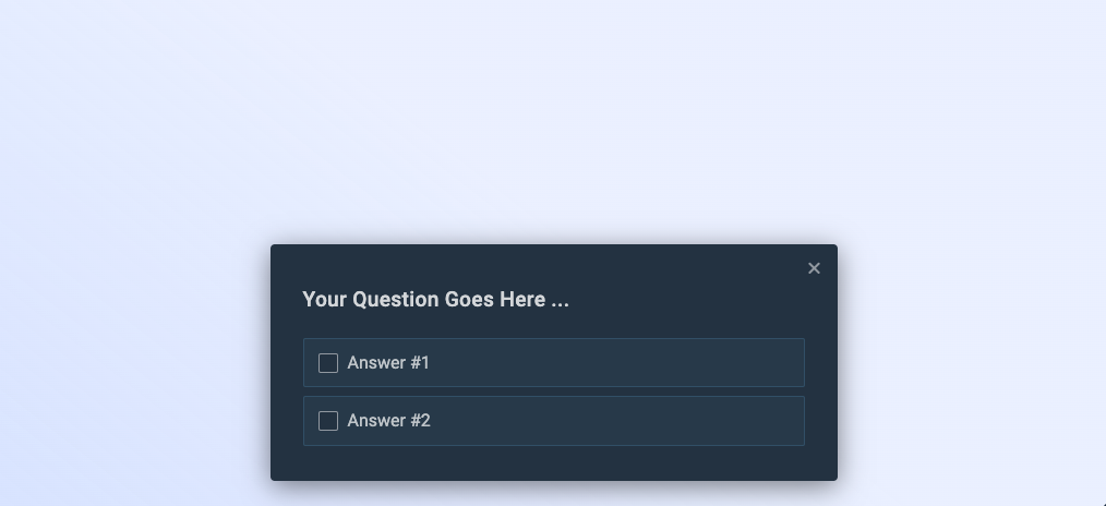
Depending on the brightness of background colors, Refiner will automatically set the text color either to Black or White. This mechanism ensures that your survey widget has enough contrast between text and background elements and that your survey is easy to read.
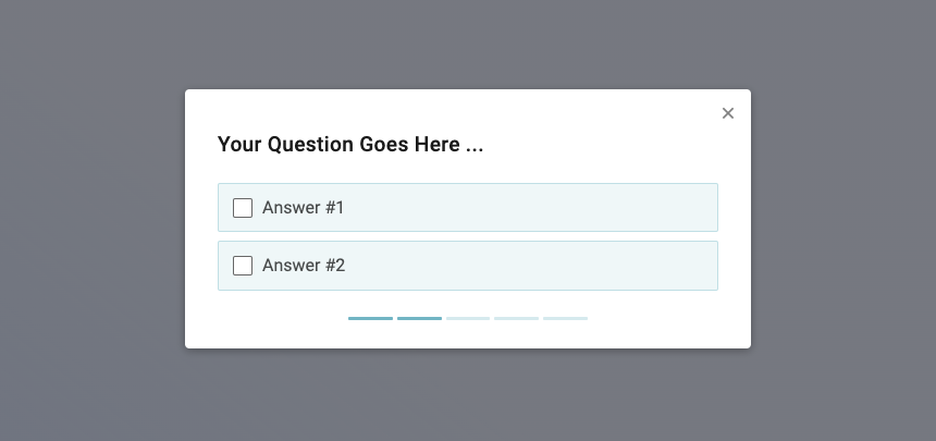
Progress Bar
If you surveys contains more than 2-3 questions, it might be helpful to display a progress bar. The progress bar shows users how many questions a survey has in total and how many are left.
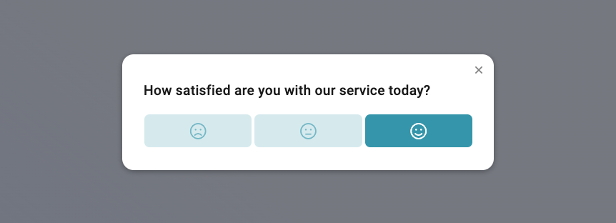
Rounded corners
To better match the style of your application, you can choose between rounded or straight corner style.
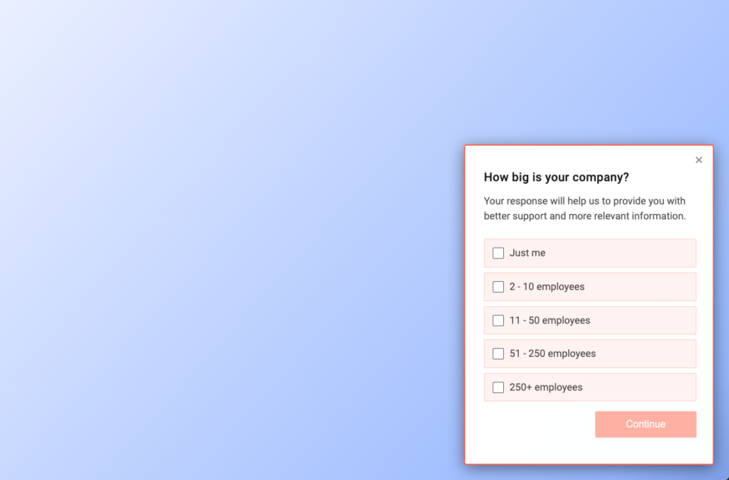
Highlighted border
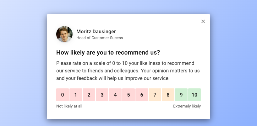
Avatar image
Adding an avatar, name and job-title to the top section of your survey widget will instantly give it a personal touch and make it more relatable. This usually results in higher response rates and overal better response data quality.
Font style
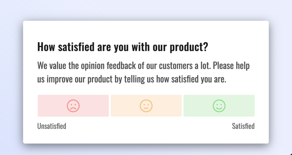
The default font of our surveys blend in nicely with most user interfaces and was optimized for high readability. By default, we are using the Roboto with a base font size of 16px. You can choose to use other popular fonts provided by Google Fonts, such as Inter, Poppins, Montserrat etc. You can also choose a smaller or bigger base font size. If you can’t find your preferred font in our list, please don’t hesitate to reach out to us.
Banner images
Banner images are a great way to mirror you brand inside a Refiner survey. The option to upload custom banner images is available for In-product surveys on web and mobile.
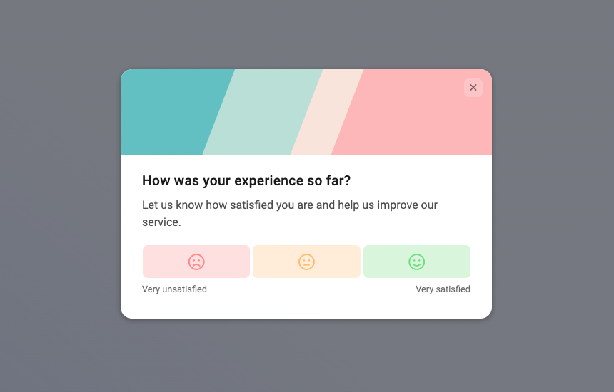
You can upload one banner image per survey in the Design tab. You can also choose to upload specific banner images for each question individually.
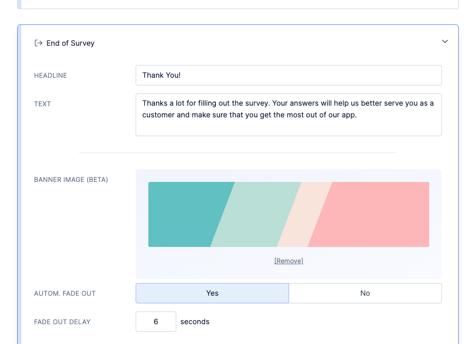
As an alternative to banner images you can also include images in the body text of your survey using Markdown syntax.
Upload logo
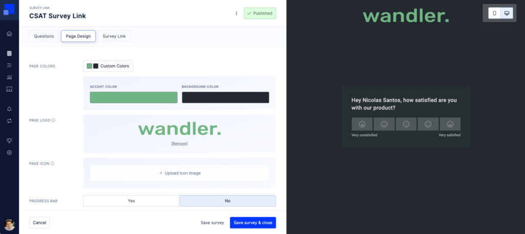
Survey Pages and Email Surveys let you upload a logo that is displayed in the top section of the survey page. You can also upload a page icon which used by web browsers.
Text-direction
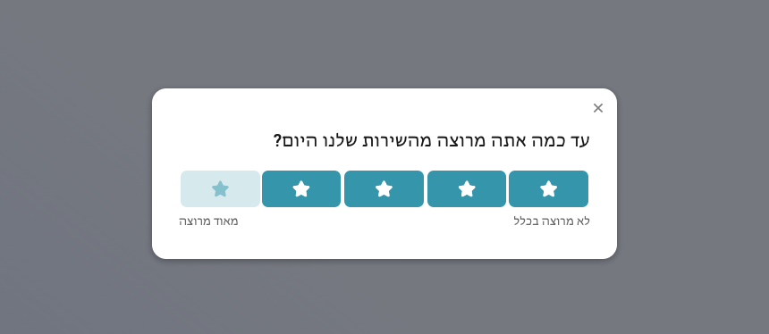
You can switch the text direction from Left-to-Right (LTR) to Right-to-left (RTL). This setting might get overwritten for specific languages when using our Translations feature.
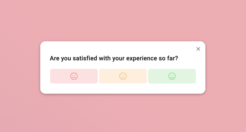
You can choose to hide the “x” close button which is otherwise displayed in the top right corner of an in-product survey.
We usually recommend to keep the close button visible to guarantee a good user experience. There are however various situations where hiding the close button makes sense. For example, when you running on onboarding survey with a centered modal layout and completing the survey is mandatory.
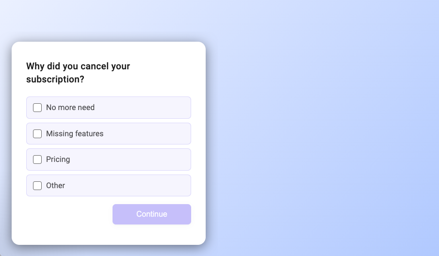
Some survey question types will display a “Back” button when they are placed after the first element. As the name suggests, the button allows a user to navigate back to the previous question and modify their response. You can choose to disable back navigation for all questions in your survey. If disabled, users can’t modify a response once given.
Customize backdrop overlay
A backdrop overlay is displayed for Web App Surveys using a centered modal layout, as well as native mobile surveys with bottom sheet layout. You can customize the color of the overlay and set an opacity level. You can also choose if a click on the overlay will close the survey or keep it open.
Hide Refiner branding
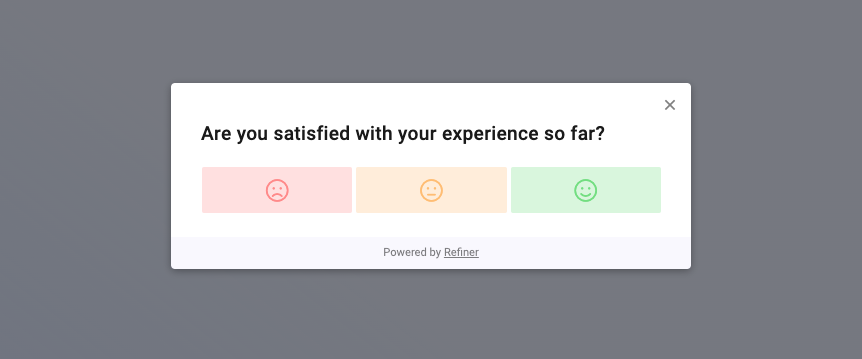
Customers on a paid subscription can hide the Refiner branding from their surveys entirely. Surveys from users on a free plan will show a small link to Refiner in the bottom.
Default design settings
If you are planning to run multiple survey campaigns, you’ll likely want to set default values that will automatically applied to all newly created surveys.
In the global settings of your environment (SETTINGS > DESIGN SETTINGS) you can set default values for the color theme, font settings, the widget position for Web App Surveys, etc.
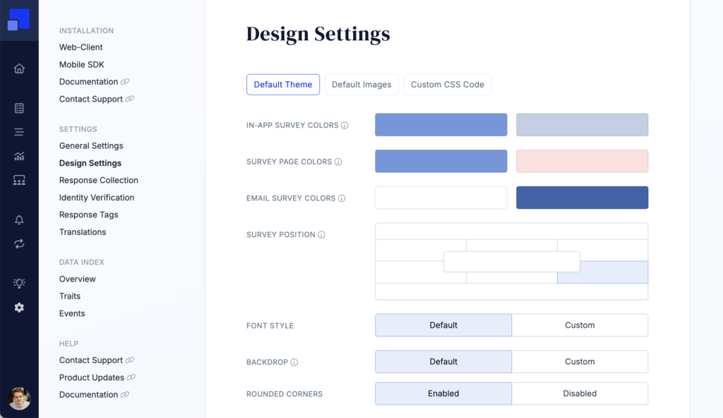
Styling with CSS code
For advanced styling needs we are providing the option to inject custom CSS into surveys. Using custom CSS code opens up virtually endless styling possibilities, such as resizing the survey widget, adjust colors, padding, etc.
The custom CSS code option is currently only available for customers on an Enterprise plan. We can unlock this option for customers on the Growth plan on request though. Please contact our team to get more information.
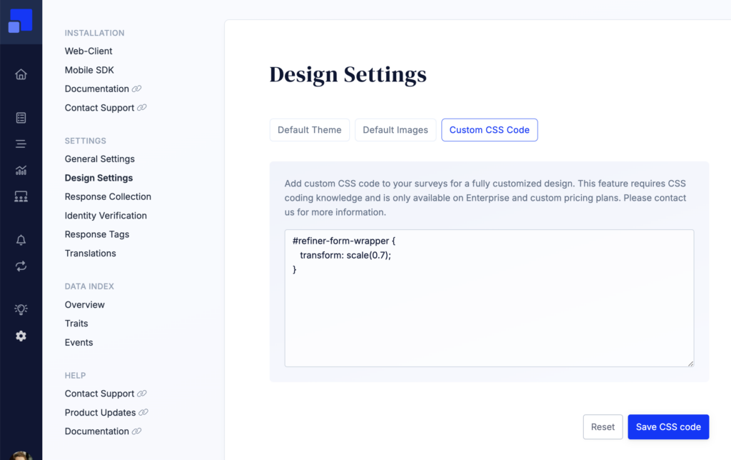
You can inspect the HTML structure of our surveys in the survey editor.
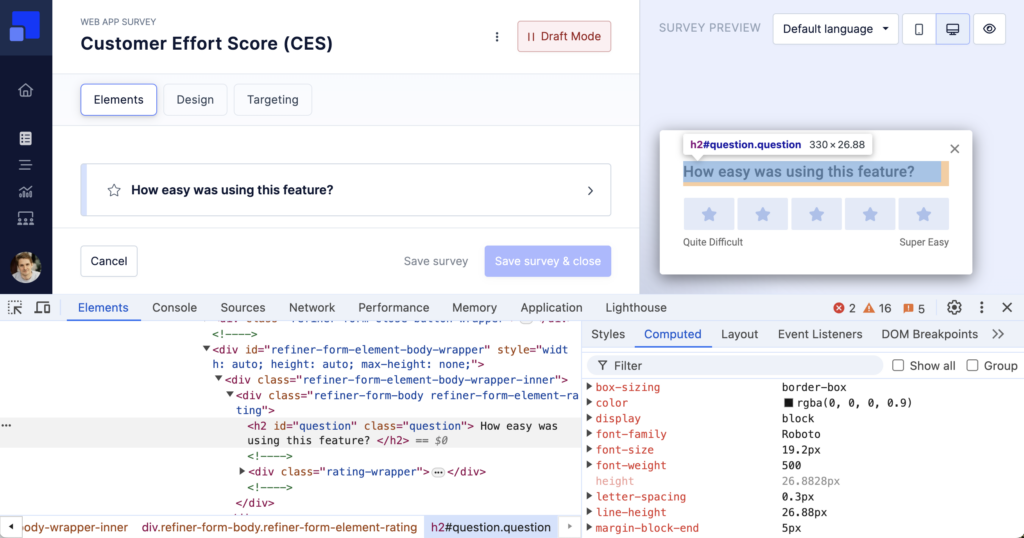
The CSS code will be applied to all surveys in your environment. The survey wrapper elements have various CSS classes that will help you to scope down the CSS code if needed, such as .form-bottom-centered, .form-mobile-sdk, .form-<survey-uuid>, etc.